Project Details
Duration: 3 months
Award: Best Design Award (Fall 2025)
My role: UI/UX designer
Tools: Adobe Illustrator, Figma, After Effects, Miro, Claude
Project partner: Brianda Valtierra Carrillo
Client: Lindsey Brammell
Advisors: Lindsey Brammell, Amir Attia
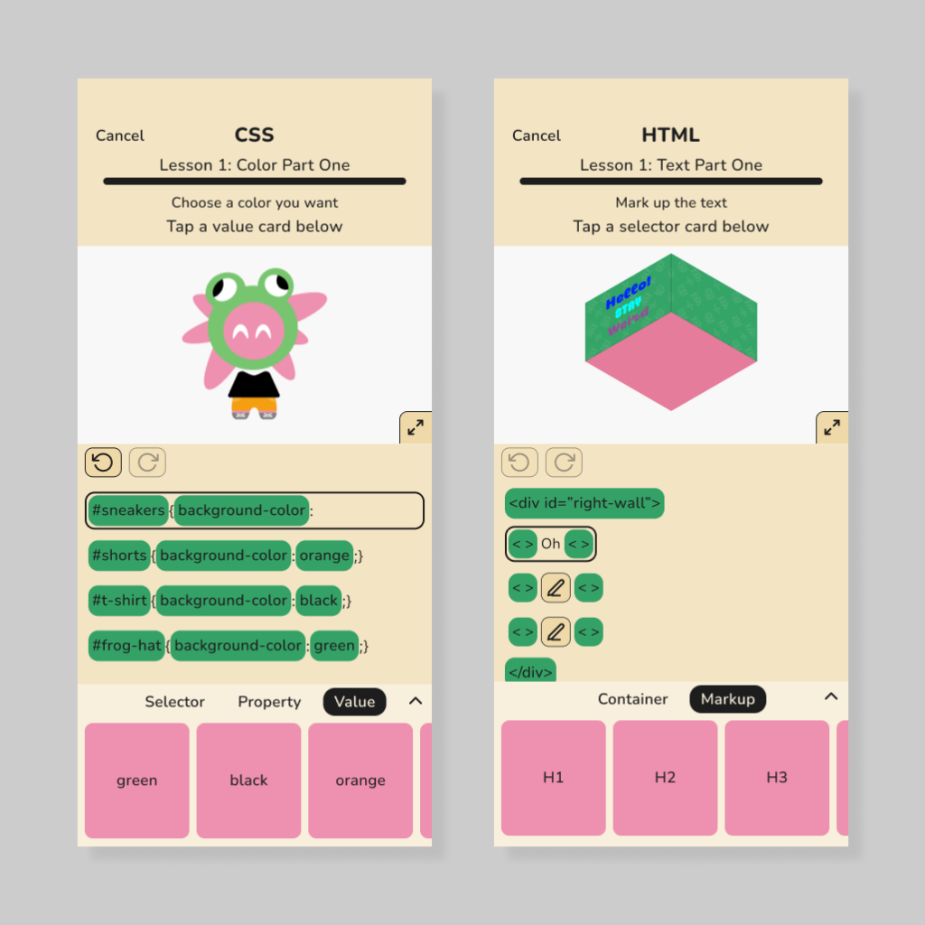
This was a capstone project proposed/commissioned by Lindsey Brammell, a professor at California State University, Monterey Bay. The project involved designing an app for middle school girls to learn HTML, CSS, and design. Although some responsibilities were shared, Brianda Valtierra Carrillo was primarily responsible for developing a board game version of the app as well as the brand identity, while I was primarily responsible for the UI/UX design of the app.
Defining the Problem
The problem we identified is that many middle school students lack access to adequate resources to learn HTML, CSS, and design. This is particularly true for middle school girls, who face significant barriers in learning STEM subjects.
User Surveys + My Insights
I made surveys collecting qualitative data from middle school teachers, and surveys collecting quantitative data from middle school students. Survey questions were brainstormed using Claude, which I then refined.
There was two responses from middle school teachers and six responses from students.
Insight One: Video Game Preferences
- Summary: Middle school students primarily enjoy creative/building video games. Most students enjoy a healthy amount of competition with friends, though a game being too competitive could make them want to quit.
- Supporting data:
- 66.7% of students answered that their favorite type of video games are building/creative video games.
- 40% of students answered that playing against friends would be the number one feature that makes them want to play a video game again (not counting those who said they did not really play video games).
- 40% of students answered that a game being too competitive would be the main reason they stop playing a game (not counting those who said they did not really play video games).
- Design decisions:
- Activities in the app revolve around building or creation.
- There are in-app portfolios where users can choose to share their creations with their friends (voluntary friendly competition).
- Trophies (achievements) are visible to friends on a user’s profile.
Insight Two: Perceptions of Web Design and Coding
- Summary: Middle school students tend to find the concepts of coding and web design to be cool, fun, and interesting. They do not feel that web design or coding would be easy.
- Supporting data:
- Words that come to mind when students think of web design: interesting (80%), fun (60%), cool (60%).
- Words that come to mind when students think of coding: interesting (75%), fun (75%), cool (60%).
- 0% of students answered that they think of coding or web design as easy.
- Design decisions:
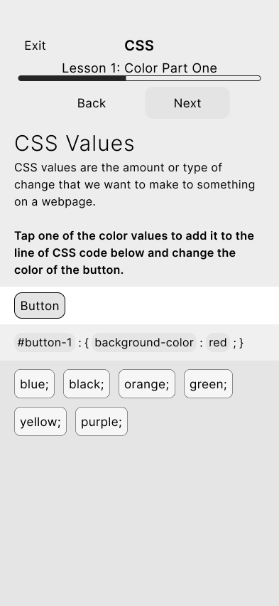
- Students tap on snippets of code to write lines instead of having to remember and type exact syntax.
Insight Three: Learning Preferences
- Summary: Middle school students benefit from taking a break and changing things up during lessons to maintain their interest.
- Supporting data:
- “When my students lose focus on a topic, I change it up by having them move around or take a brain break. It is hard to sit and focus for a long period of time so movement is necessary” (Middle School Teacher).
- “Either we do a quick brain break or game, or we change a rule slightly to what we were doing” (Middle School Teacher).
- Design decisions:
- Lessons don’t focus on the same subject back-to-back (example: CSS lesson on type follows lesson on color).
Personas
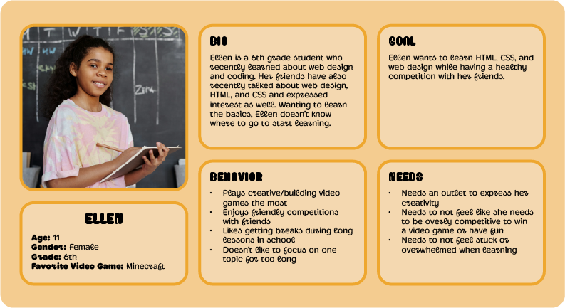
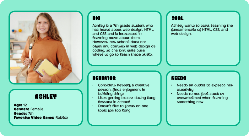
Site Map
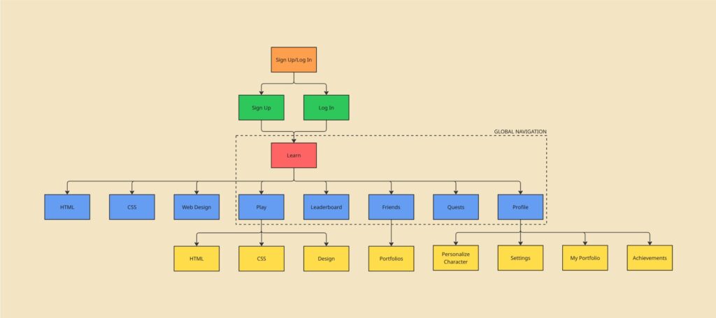
User Flows
User flow for Ellen:

User flow for Ashley:

Sketches
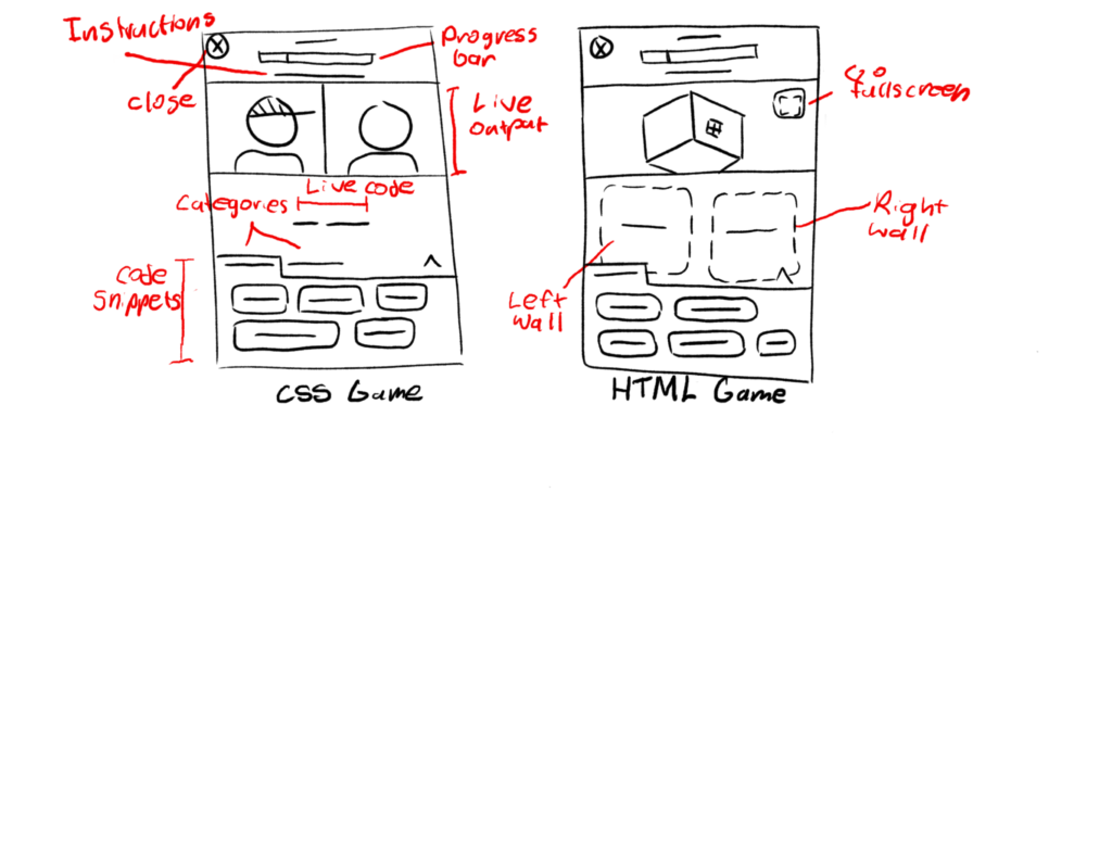
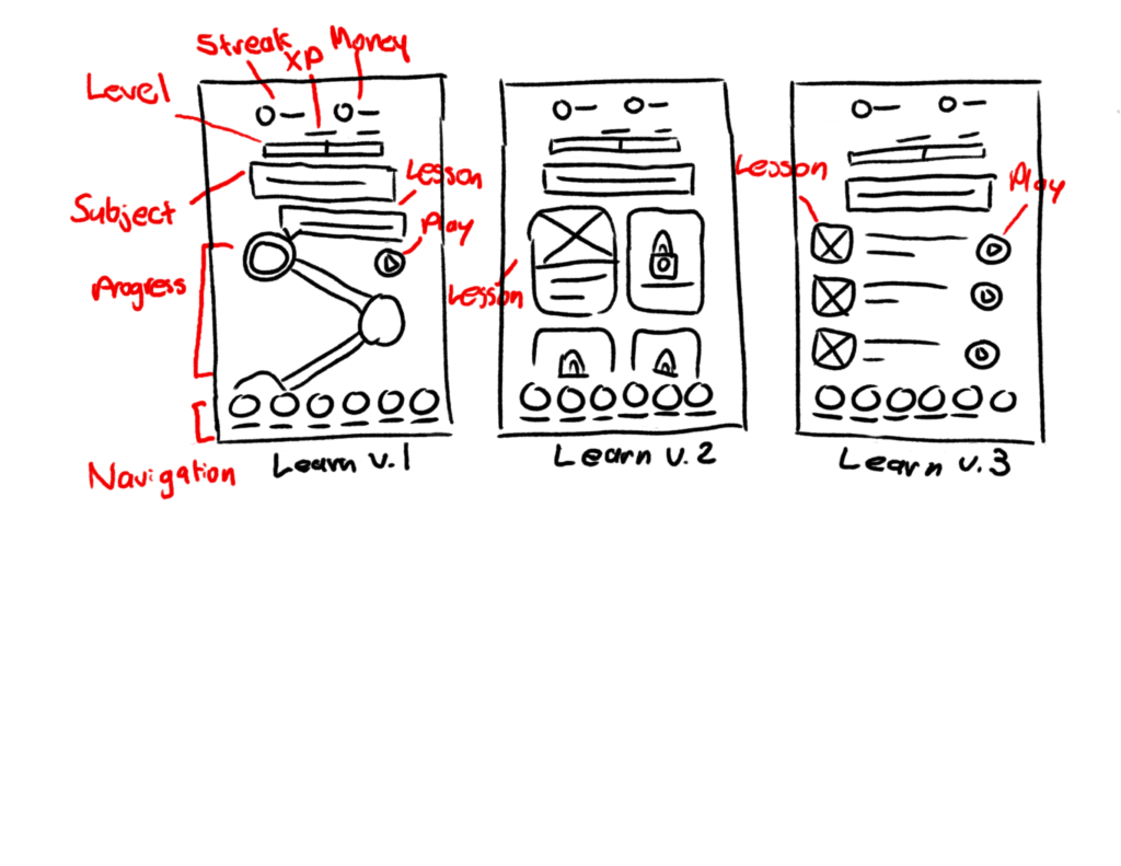
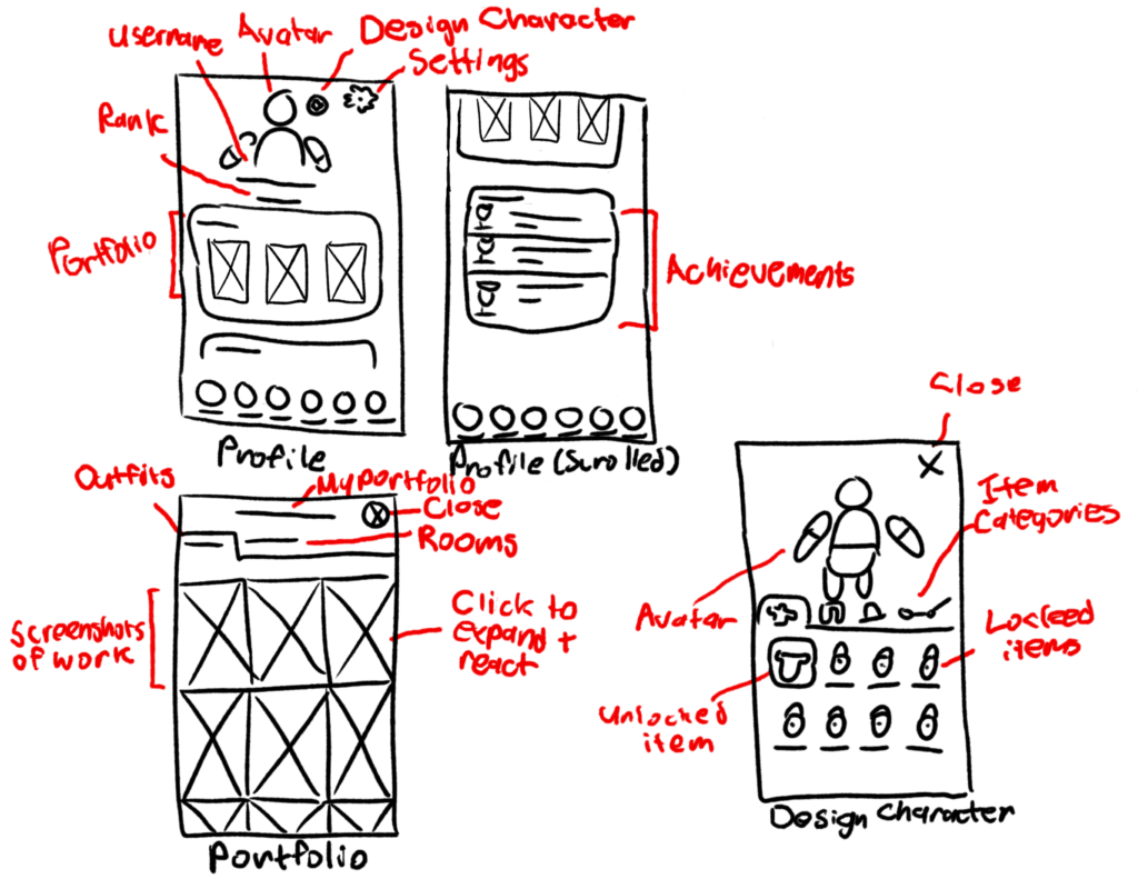
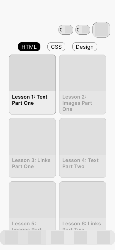
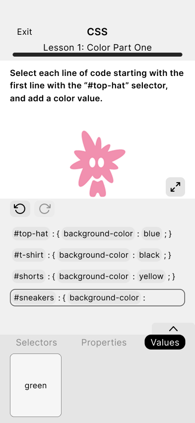
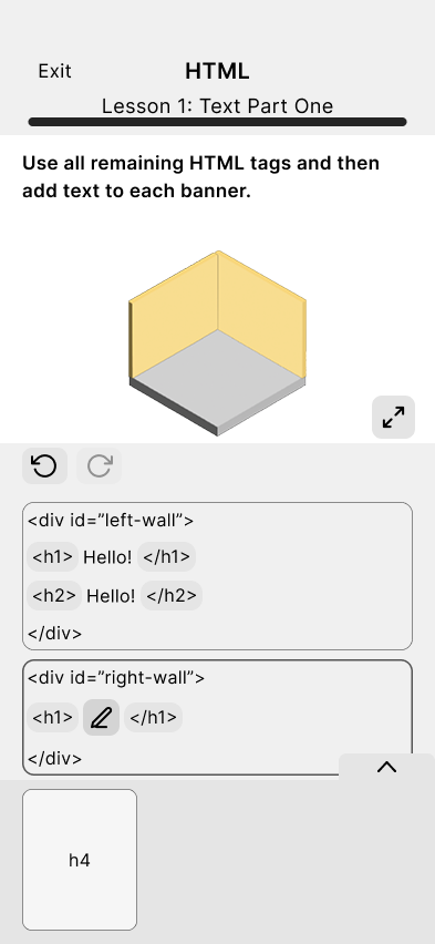
Mid-Fidelity Prototype
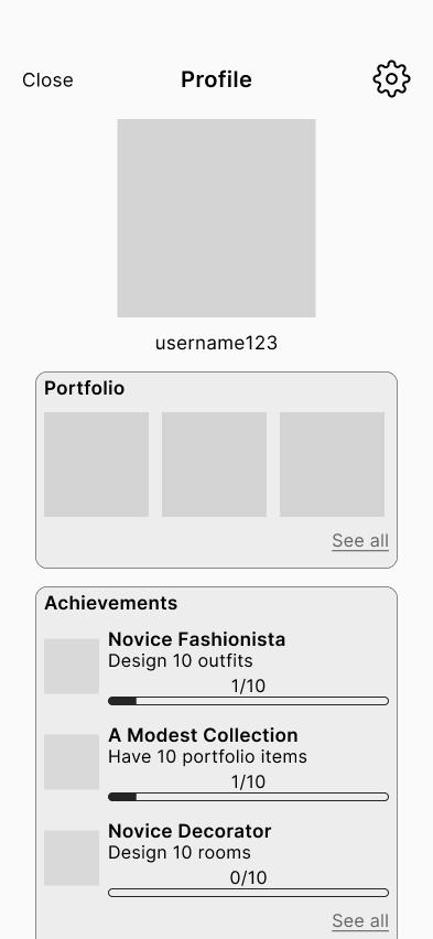
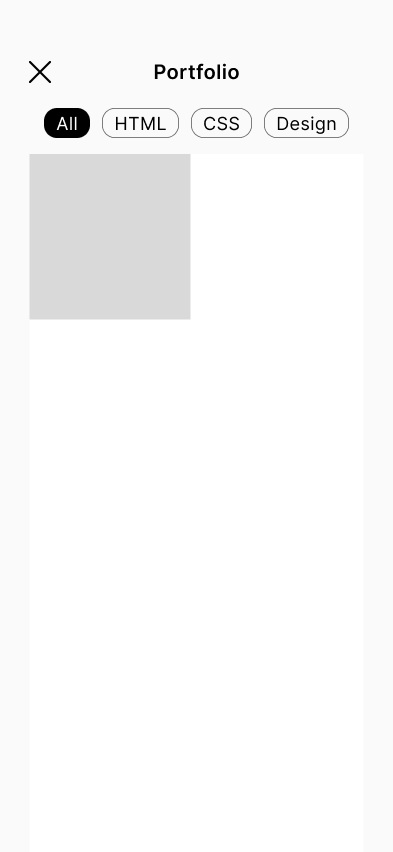
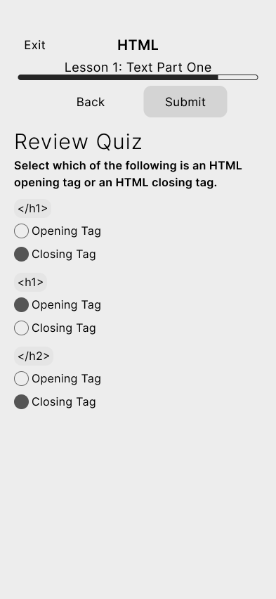
This is where I established the layouts which would be followed once screens became more developed.
Screens I designed:

High Fidelity Prototype (Version 1)
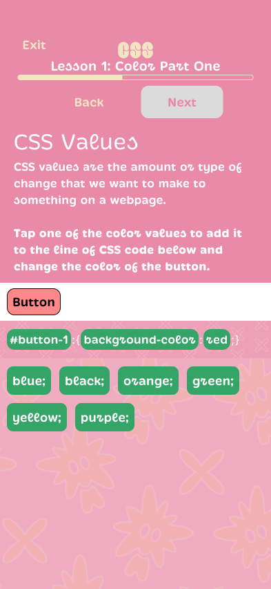
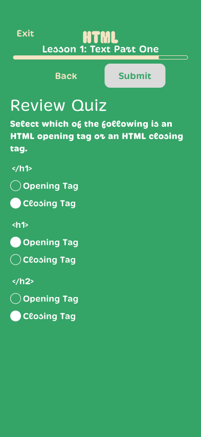
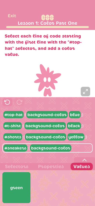
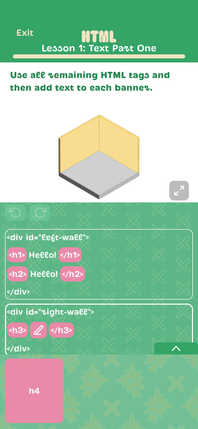
I worked on styling the lesson/game screens, while Brianda worked on styling the core app screens (log in/sign up, learn, profile, portfolio).
Brianda established how the brand identity would translate onto the core app screens first by adding colors and typefaces to the layout I had established, and I followed suit and applied the style to the lesson/game screens. All background patterns and mascots were designed by Brianda.
Screens I designed:
App/Game Assets
The character/mascot I used in some of the assets was designed by Brianda.
Icons:
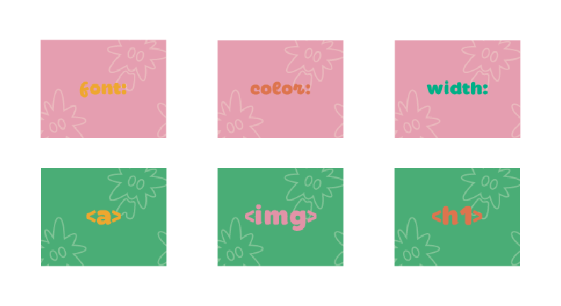
Lesson thumbnails:
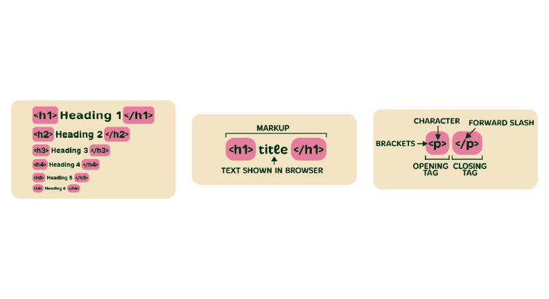
Lesson assets (layout/content taken from existing lessons made by our advisor/client):
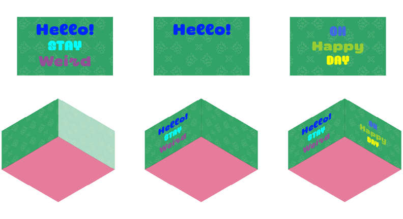
HTML game assets:
High Fidelity Prototype (Version 2)
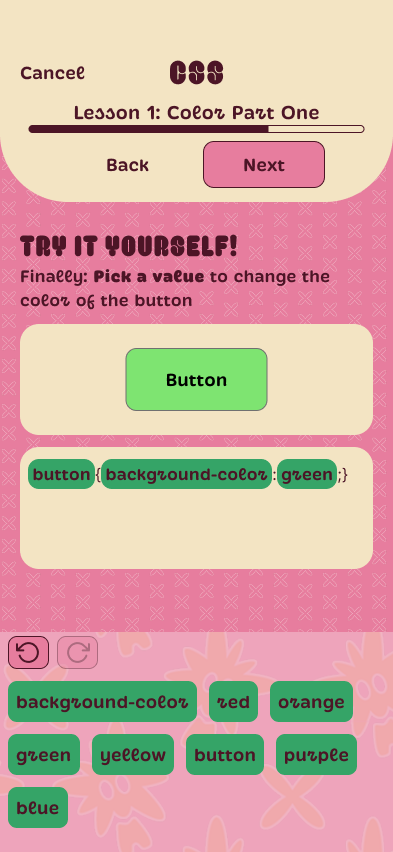
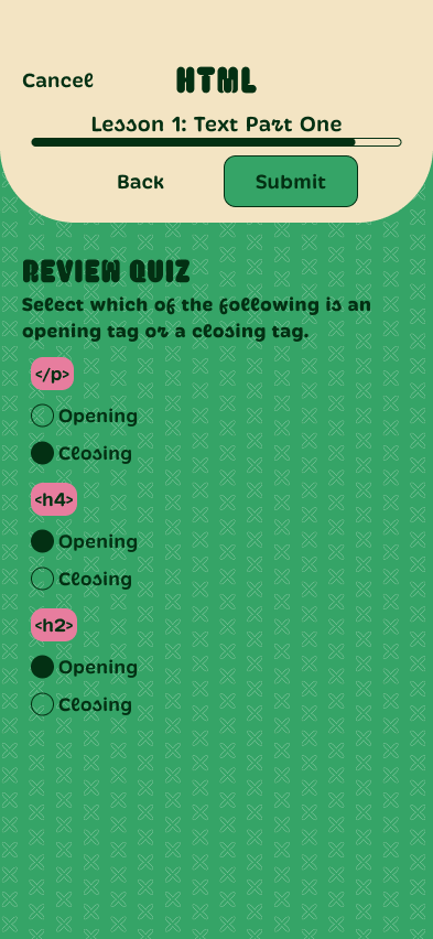
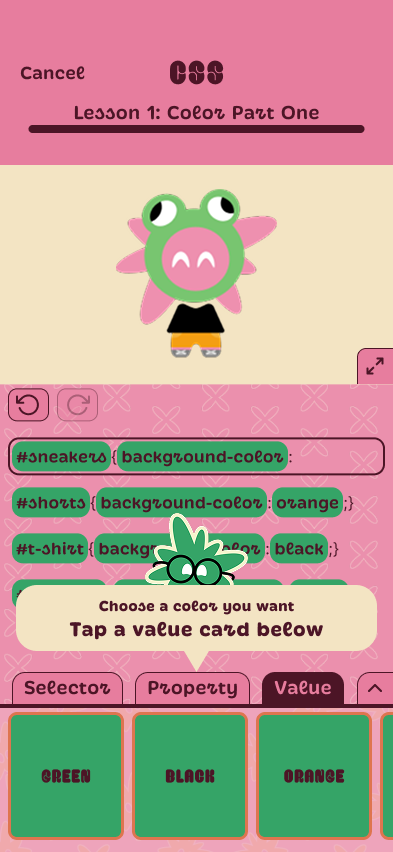
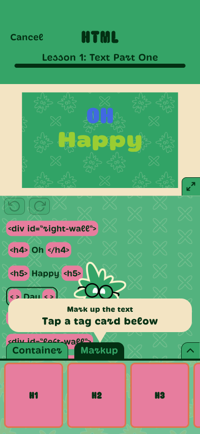
In addition to other interface design tweaks, I made color changes to Brianda’s screens and my screens as color contrast was not sufficient to meet WCAG guidelines in several places.
Screens I designed:
The Pivot: Optimizing for Accessibility & Scalability
Because of the limited timeframe of the project, I wasn’t able to pursue other interface design directions.
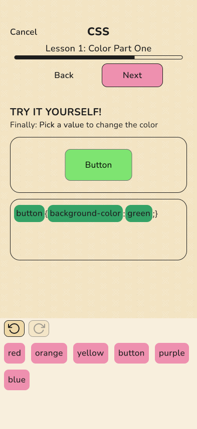
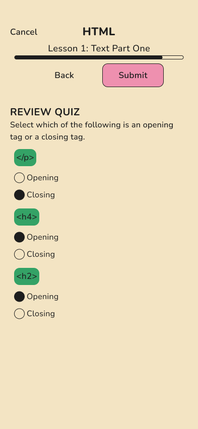
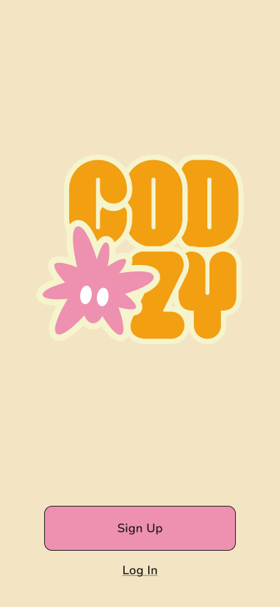
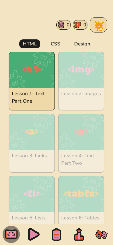
A couple months after the semester ended, I created a modified version of the interface. Even though the design I came up with when I was working on the actual project was fun, it still felt too stylized to be accessible. Also, components with too much visual variance and too little modularity are not healthy for a design system.
In this version the color palette was reduced significantly to reduce cognitive load, and serif fonts were replaced with sans-serif for readability. I revised all app screens. Navigation icons and mascot designed by Brianda.
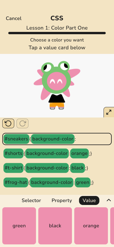
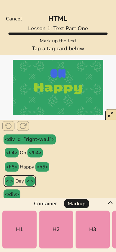
Game/lesson screens that I designed before:


Game/lesson screens I designed after (the “pivot”):
Core app screens designed before:
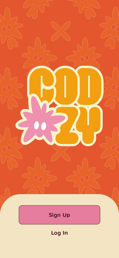
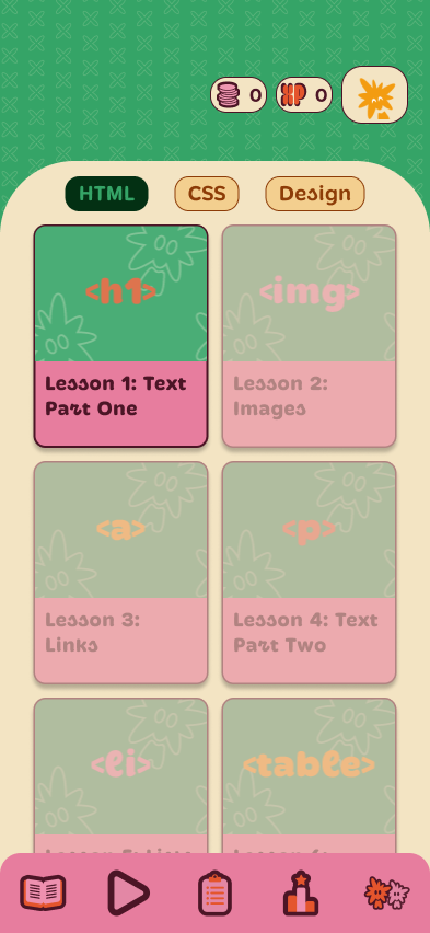
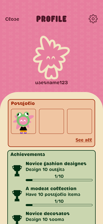
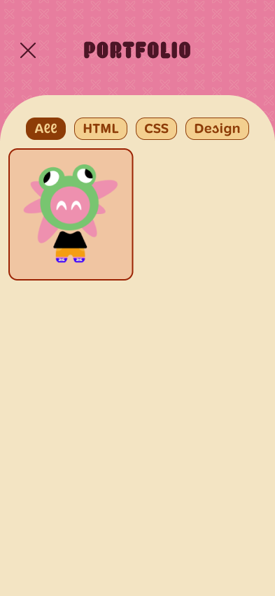
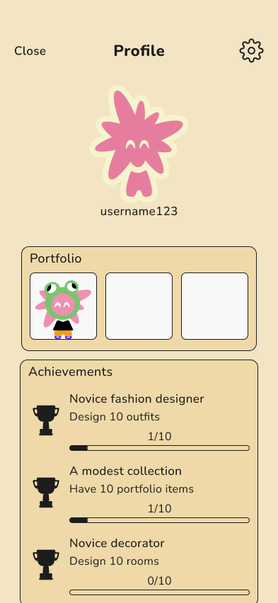
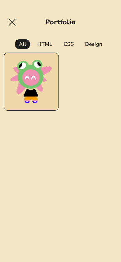
Core app screens I designed after:
Loading Screen Motion Graphics
Loading screen motion graphics were made to help clarify system feedback when navigating through the app. Logo and pattern designed by Brianda, I designed the loading bars and motion in After Effects.
Reflection
- Learnings:
- Design thinking is different when designing for kids, potential differences in mental models and attention span should be considered
- Designing learning platforms involves balancing fun, usability, and being effectively informative
- Challenges/Limitations:
- Only 8 participants in the user surveys
- Time constraints made usability testing unfeasible
- We crafted the visual design of the app before considering usability
- Integrating the brand identity into the app mid-project required extra coordination, as Brianda had not been working on the Figma files until that point
- What I would do differently:
- Prioritize usability testing and getting more survey responses rather than focusing too much on visual design
- Recognize accessibility requirements earlier, ideally before moving on to high-fidelity
- Organize and label the Figma file better so it can be picked up by anyone on the team, and/or develop a concrete style guide or design system for the app early on so that extra coordination does not slow down our workflows
