
Project Details
Duration: 3 months
My Role: UI/UX designer
Tools: Figma, Lyssna, Miro
Team Members: Alyssa Welter, Karisma Zaragoza, Skye Harrop
This was a project for a ficticious trip discovery/planning app for the Fall semester course “CST 446: User Research and Experience Design” at California State University, Monterey Bay.
Defining the Problem
The problem we identified to base our project around was that when college students move to a new area for school, they need a way to find out about the attractions in the local area that they can visit in order to achieve higher motivation levels, deeper connections, better time management, and better mental health.
Observations
Our group did a total of 8 observational field studies to better understand our target users. We did 2 observational field studies using the “pure observation” method and 6 field studies using the “deep hanging out” method.
For my observational field studies I conducted 2 deep hanging out studies where I put myself in the shoes of a college student looking to find new things to do in the area around campus. I documented the research and planning process of going to Jack’s Peak Park in Monterey with friends and going to Vince DiMaggio Park in Marina solo.
Once all team members conducted their field research, we brought all the data we gathered together and analyzed it using affinity diagraming.
Group Observation Findings
- Types of planning and research:
- Digital planning is an essential tool for college students to have
- Some students make loose plans but are still able to enjoy their experiences
- The strictness of a plan can influence motivation levels
- College students use a variety of different planning methods
- Lack and/or surplus of motivation:
- College students are highly reliant on technology, discouraging them from leaving the house
- Students may be more willing to leave the house if there is some kind of task or incentive based around doing so
- Communication between peers:
- Communication is an important part of the planning process
- College students feel more incentivized to leave the house if they are accompanied by a friend
- Communication through social media channels is important when planning outings with friends
- The comments section on social media is often where information about different locations is shared
User Interviews + Findings
Our group did a total of 4 semi-structured user interviews with people within our target user base, which is college students between the ages of 18-25 years old.
For my user interview I interviewed an alumni who recently graduated the semester prior from California State University, Monterey Bay.
After conducting our interviews we used the thematic analysis method to synthesize our results and identify patterns.
Group Insight: Adventure Preferences and Personal Interests
- Summary: Personal preferences and interests are what influence people’s activity choices for the most part, and factors such as mood can influence one’s personal preferences in the moment.
- Design Decisions:
- User influenced, algorithm-driven location discovery.
- Users answer a questionnaire to gauge their mood before they start discovering locations.
My Insight: Planning Methods, Tools, and Challenges
- Summary: Many college students prefer a kind of “hands-off” approach to planning outings where they do very little planning or follow plans made by other people.
- Design Decisions:
- Users don’t have to make itineraries to save locations, they can save them directly to their profile.
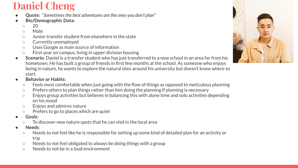
Personas
We created 4 personas, with each person completing one persona each.
Persona I made:
Journey Maps
After we made our personas we used them to create journeys maps which mapped out the current experience of finding out about a location and planning a trip. These maps helped us formulate potential features to include in PinPoint to address the pain points of our users.
Journey map I made:
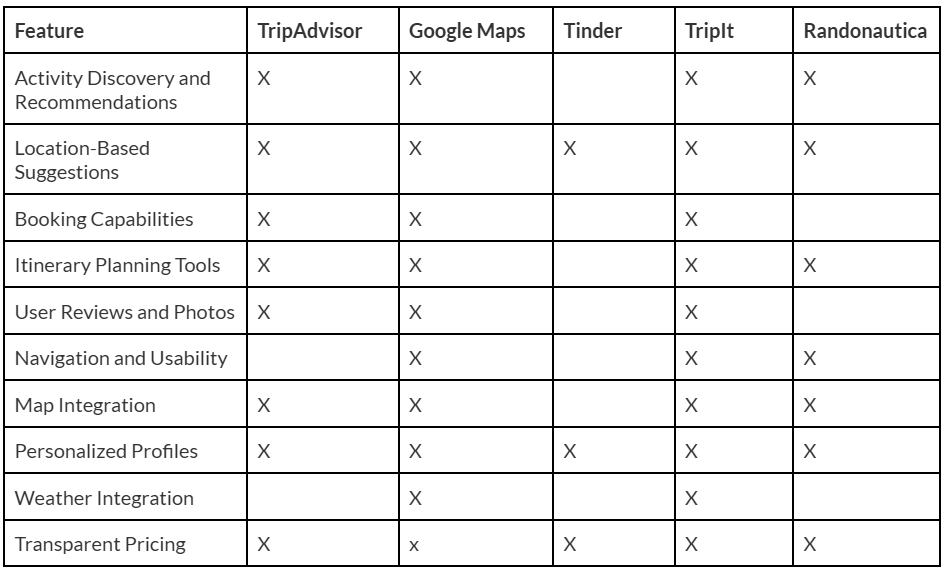
Comparative/Competitive Analysis
The competitive products we looked at were the website version of Tripadvisor, Randonautica, and TripIt. The comparitive products we looked at were Google Maps and Tinder.
Competitive User Testing
We conducted moderated user testing with one of the competitors, Tripadvisor. This would give us insights into the strengths and weaknesses of the current experience of using the mobile app and website versions of TripAdvisor, which would in turn influence our own design decisions.
Group Insight: Navigation Issues
- Summary: Tripadvisor is difficult to navigate for first-time users.
- Evidence:
- One participant commented that the interface relies too much on icons for labeling.
- The task that required the most navigation (creating a 3 day itinerary) had an average difficulty rating of 2.3/4, the highest for any task.
- Design decisions:
- Information and processes should all be clearly labeled with text.
- The location discovery feature (essentially the main feature of the app) should be the first thing the user sees when logging in.
Group Insight: Interface Familiarity
- Summary: Tripadvisor does succeed when parts of the apps mirror processes or designs found in other apps.
- Evidence:
- Two participant noted that finding reviews in the app felt similar to other apps, with one comparing it to YouTube’s comments section.
- One participant remarked that the search functionality felt like Google.
- For the in-app locations, the rating system wasn’t immediately clear because stars aren’t used.
- Design decisions:
- Screens should follow normal content conventions (e.g. having a profile, discover page, etc.).
- The discovery functionality could mirror dating apps and their “swiping” functionality (this was an idea I came up with).
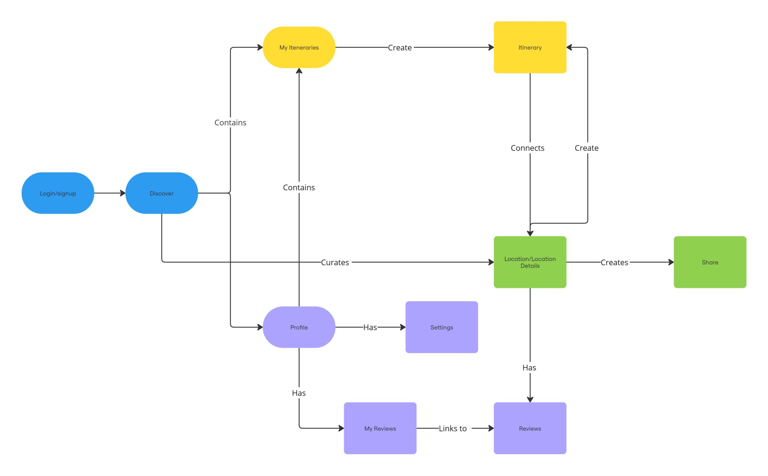
Conceptual Map
Sketches
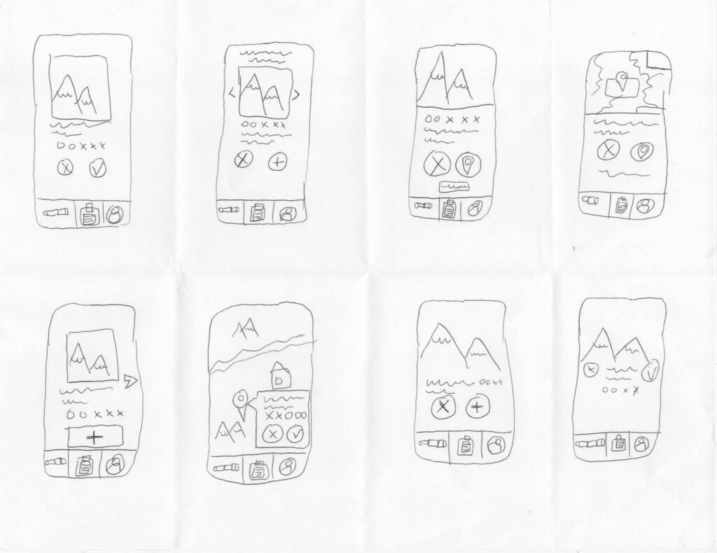
After mapping out our different screens in the conceptual map, we then decided to draft out how the screens might look visually. We used the “Crazy 8’s” method to come up with 8 variations of a screen and then picked one of the 8 sketches we made to refine into a more detailed sketch.
As a group we each chose different screens within the app to be the focus of our sketches. I focused on sketching the “discover” screen.
My crazy 8’s:
My refined sketch:
Wireframes
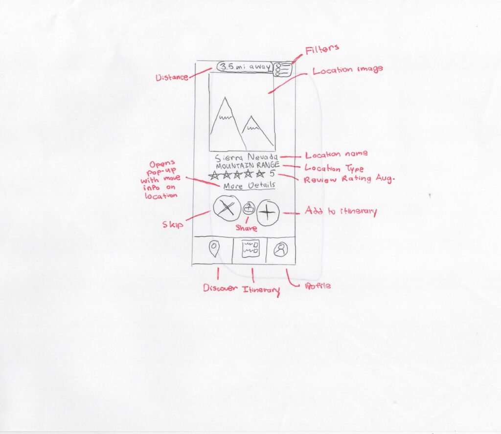
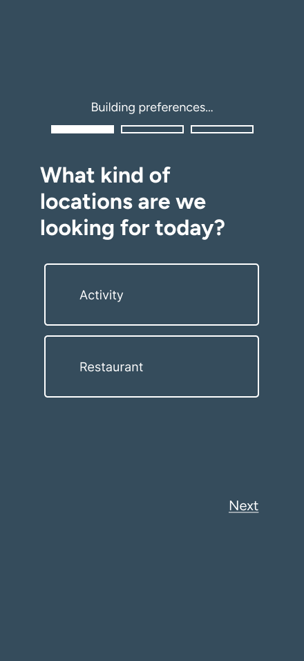
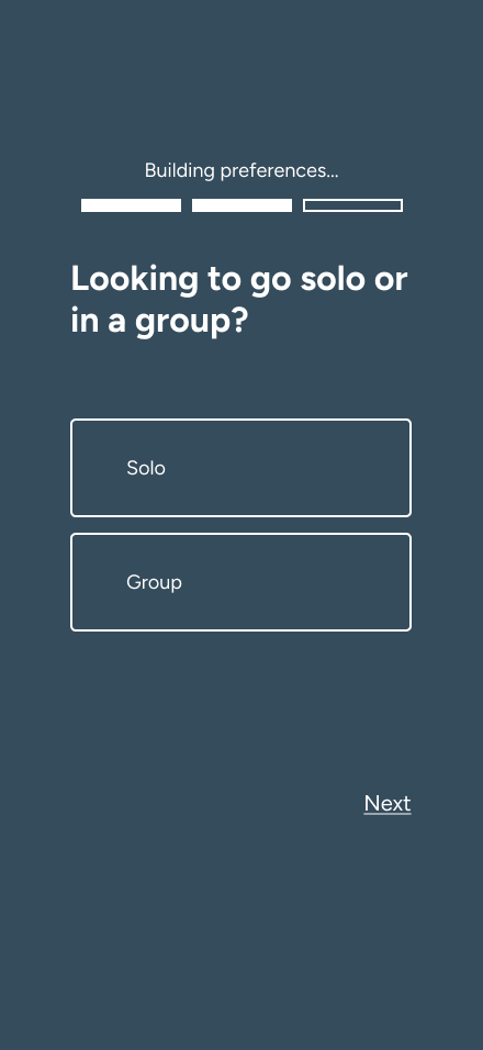
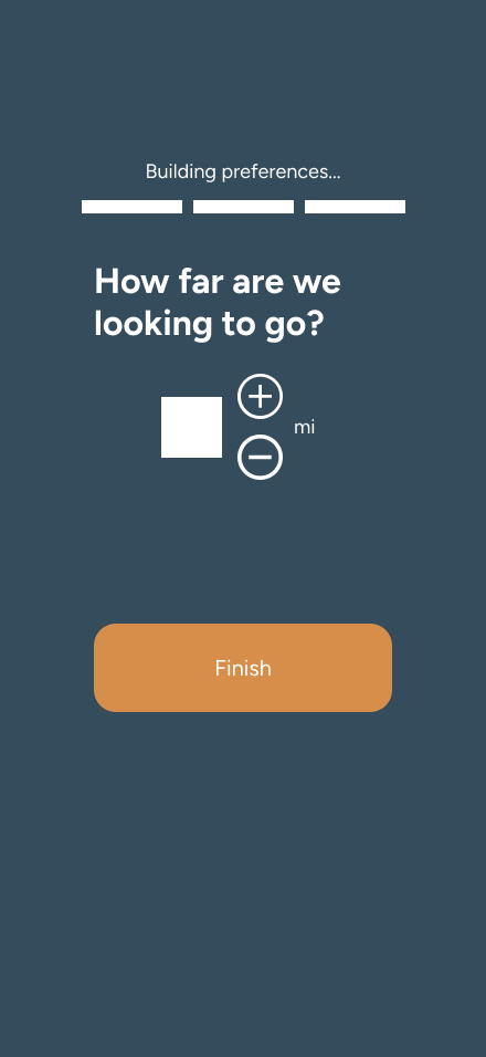
Skye Harrop and I focused on completing the task flow for finding a local attraction and adding it to a new itinerary. Alyssa and Karisma worked on another task flow.
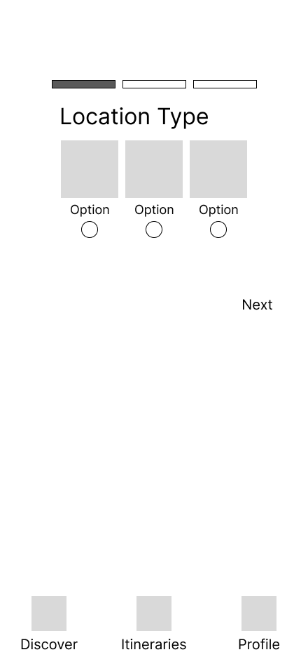
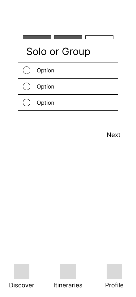
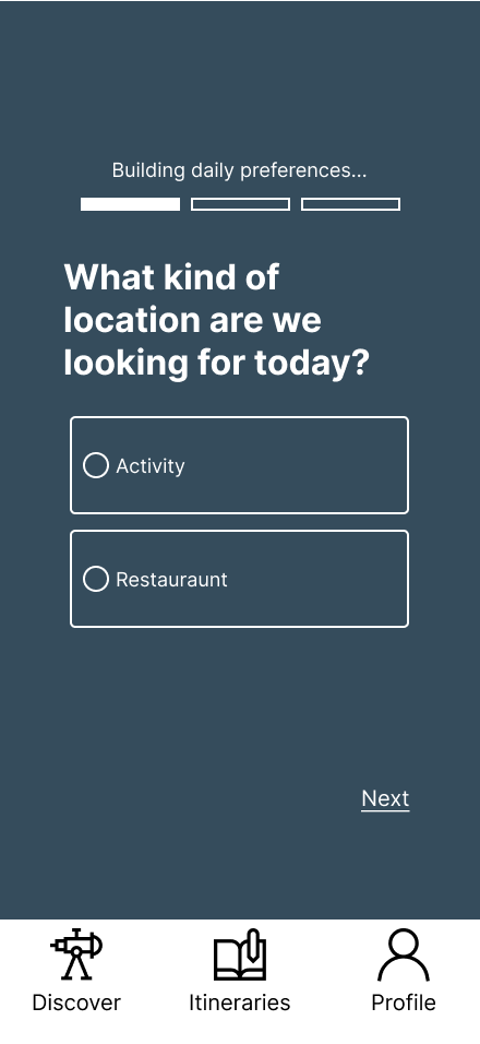
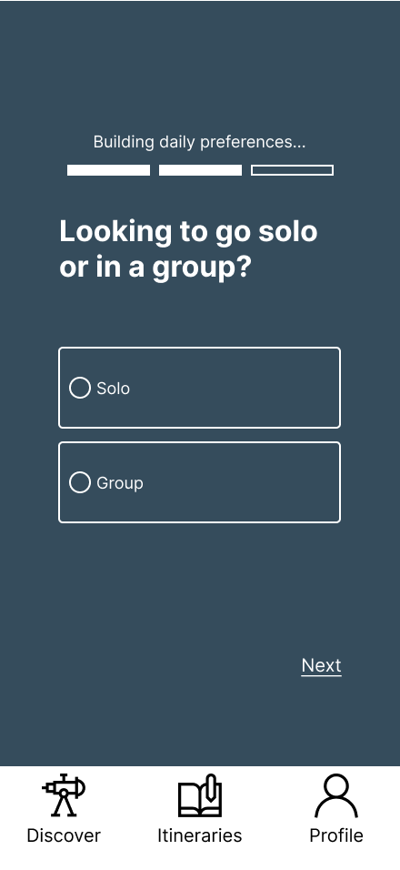
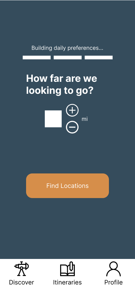
The screens I worked on were for the questionnaire process which establishes the user’s preferences before they start looking for locations.
Task flow I followed:

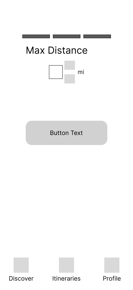
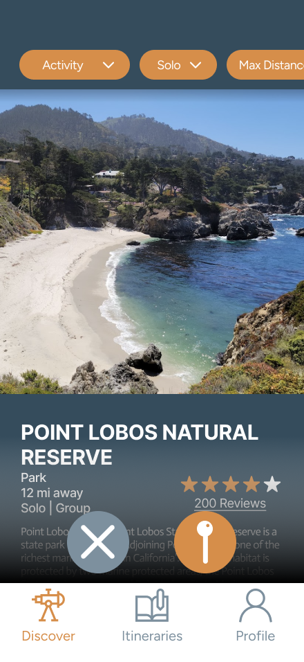
Screens I designed:
Prototype Iteration
After getting feedback from our professor and classmates, we took some of the insights we gained into building a high-fidelity prototype.
Alyssa established the color pallette we would use across the screens and designed the logo for the app.
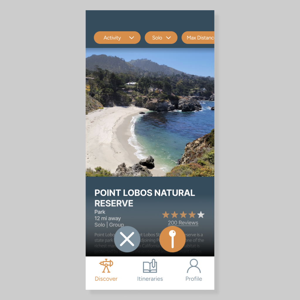
Screens I designed:
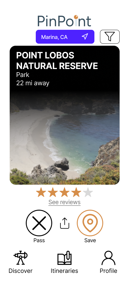
Final Prototype
Skye helped me by making active states for the buttons and connecting the screens to other screens for the purpose of prototyping.
Screens I designed:
Reflection
- Learnings:
- Meeting face-to-face or on Zoom is often important to communicate ideas when working with a team, sometimes text is difficult to communicate with (especially when conducting processes like affinity mapping)
- Extensive documentation is important when conducting user research, it is important to layout/reiterate why you are conducting research at every step
- Challenges/limitations:
- Only four interviewees
- Time limitation made it difficult to more thoroughly validate our research
- Conflicting schedules meant not every group member could make it to class every day
- What I would do differently:
- Collect quantitative data or use existing data to supplement our research findings
- Conduct more user testing (prioritize this before moving on to visual design)