Duration: 1 year and 2 months
My Role: Web designer (undergraduate student assistant)
Tools: Adobe Illustrator, Figma
Department: Info Tech & Comm Design
This project is for my student assistant role for the University Corporation at Monterey Bay. It is a state-funded project focused on creating an internet speed testing web application for internet users in California. I worked extensively with software engineers to create the visual design for the application.
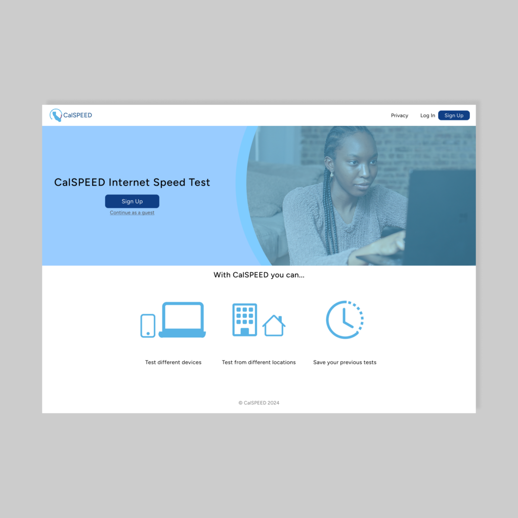
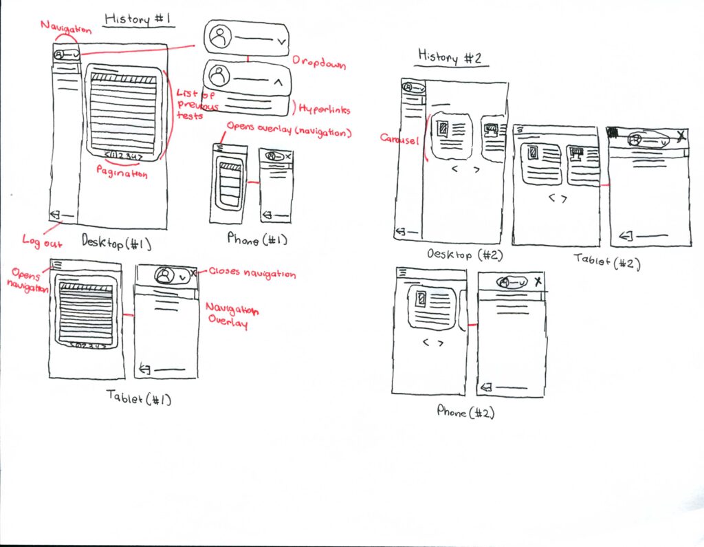
Sketches
I first started by sketching out my versions of the web application screens, using the layout of the current web app as a starting point.
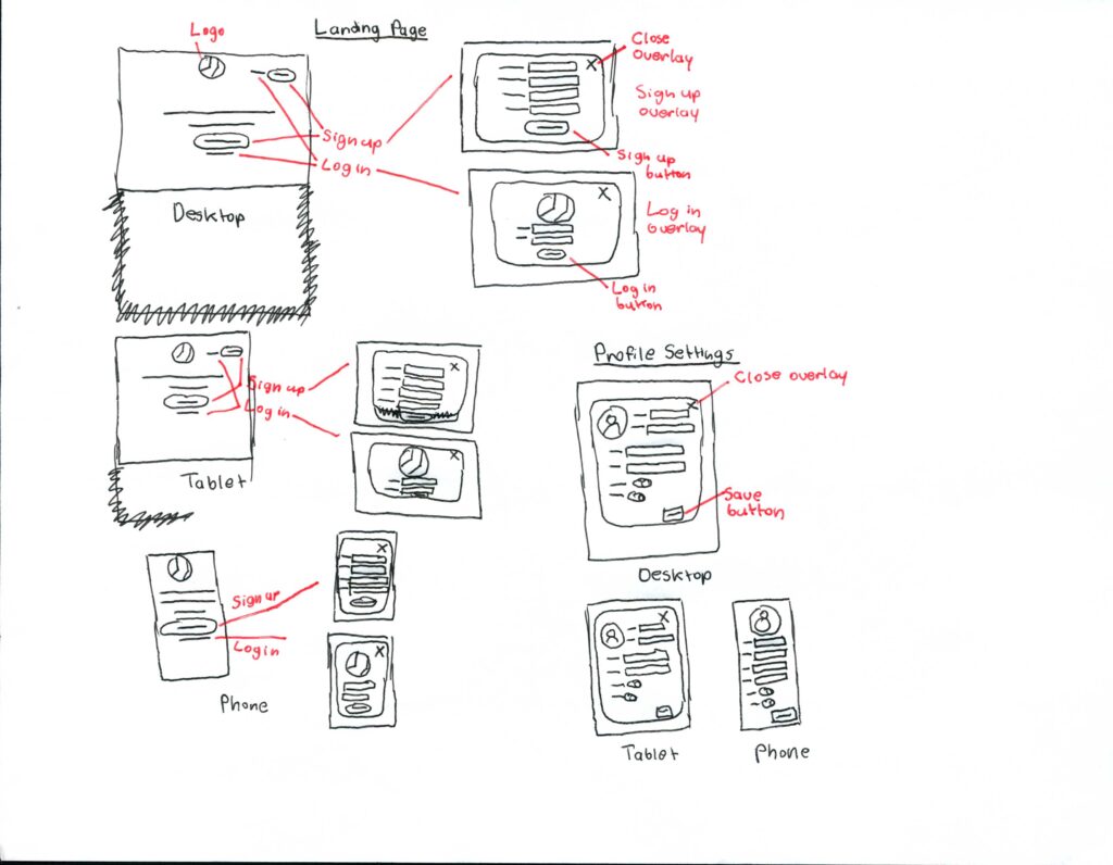
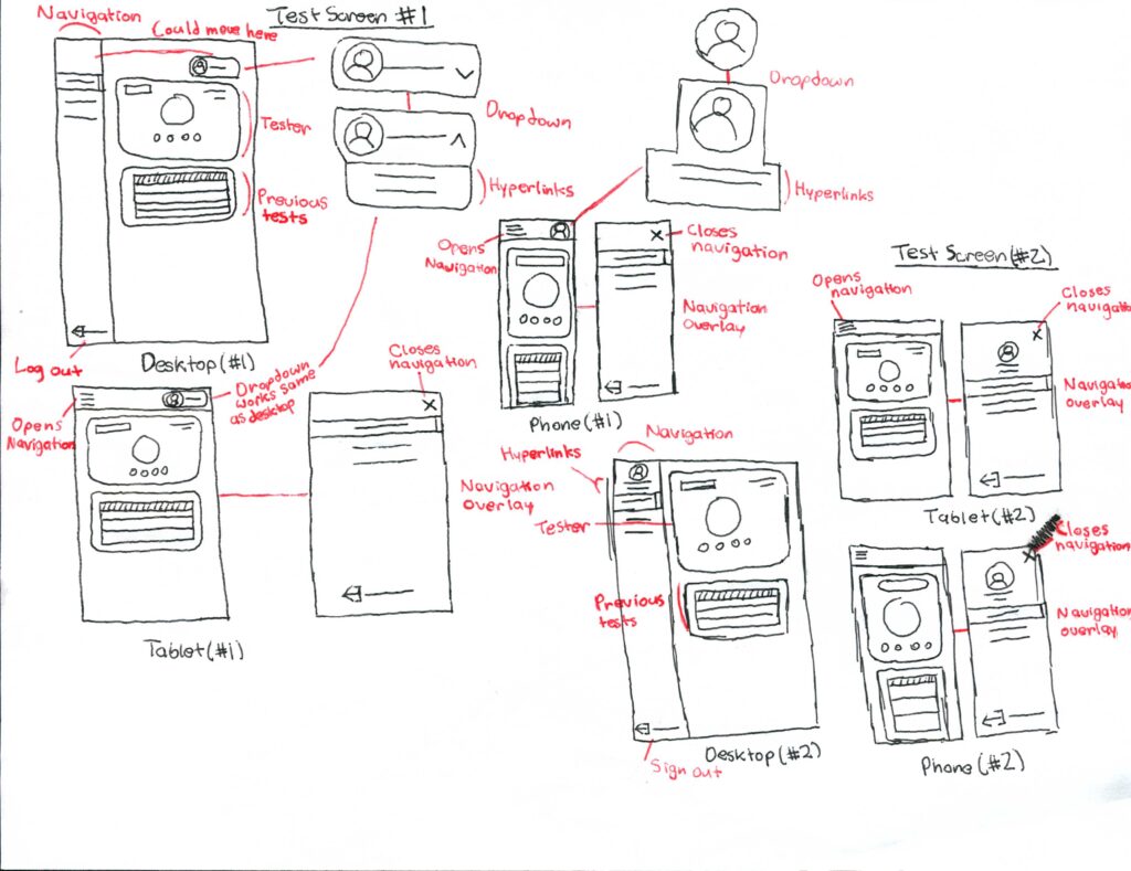
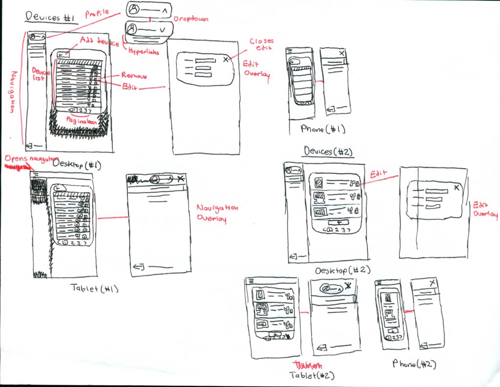
Mid-Fidelity Wireframes
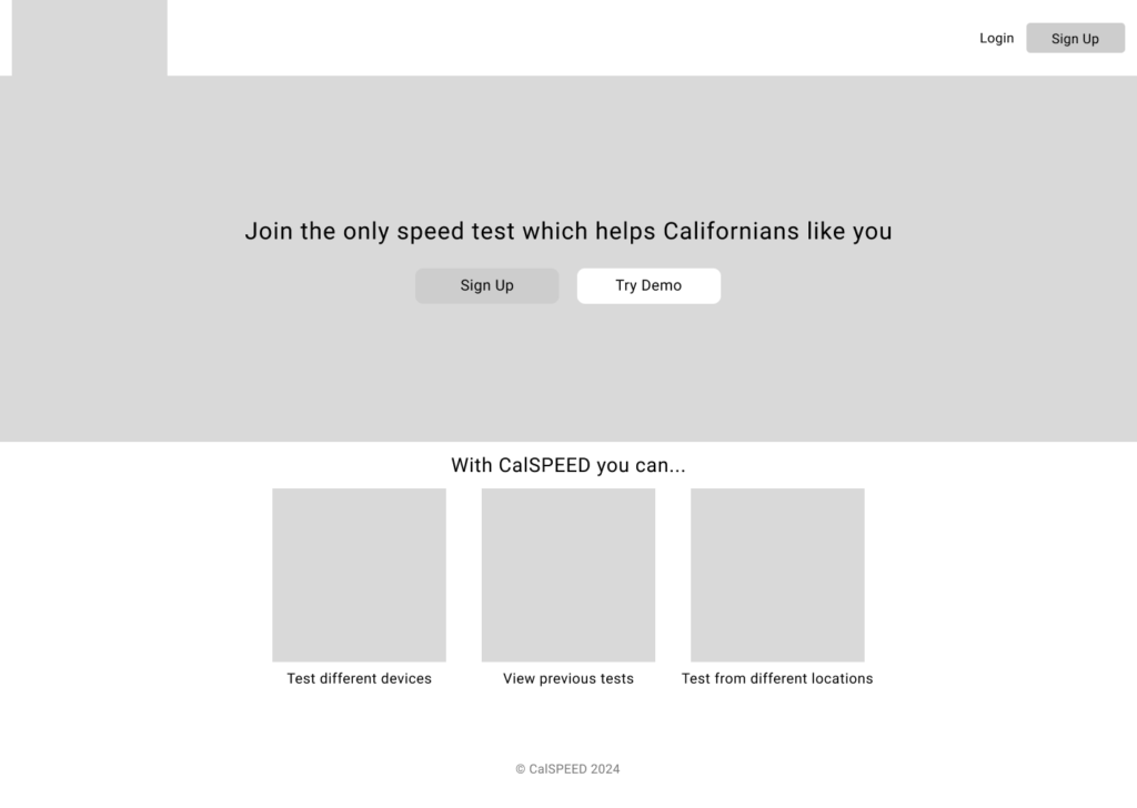
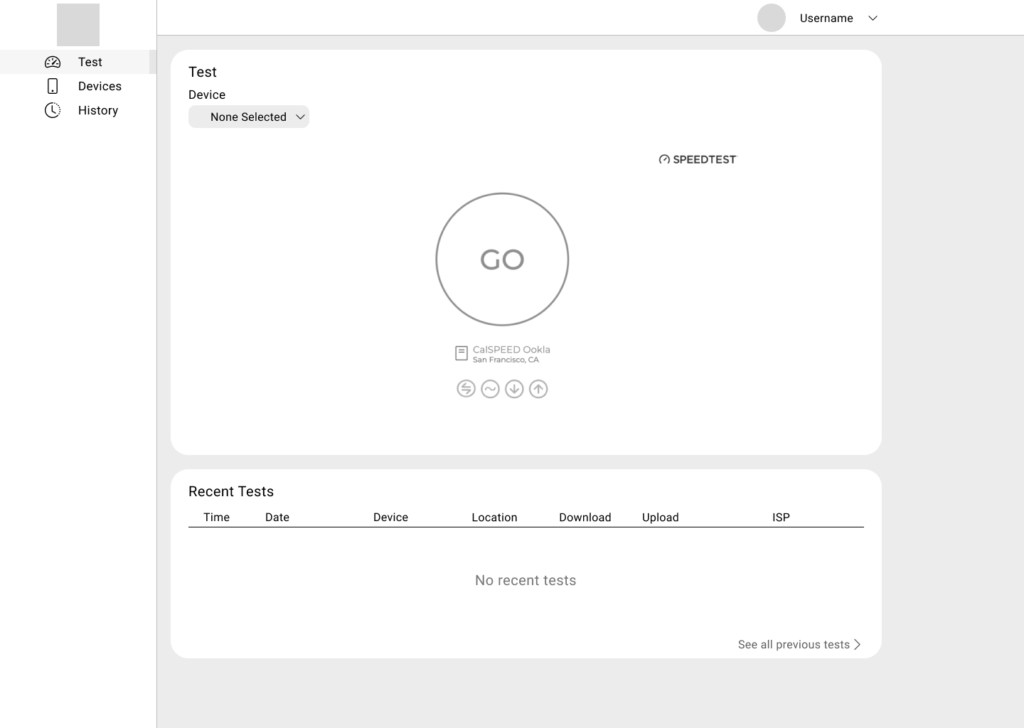
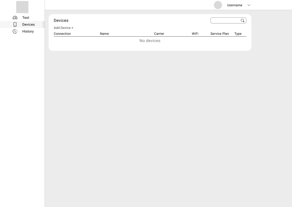
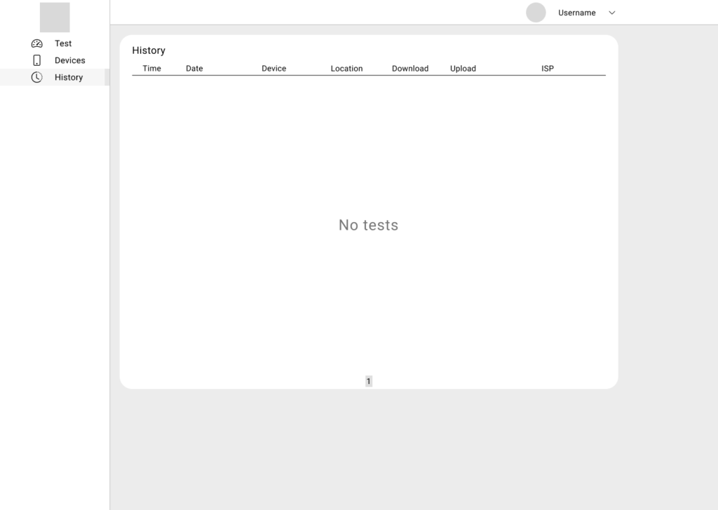
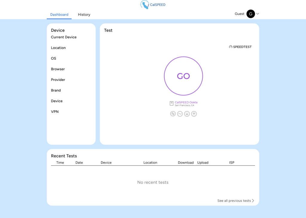
Dashboard Variation
Colors are based on existing CalSPEED branding.
This design differentiates from the existing design in that it incorporates a tab system.
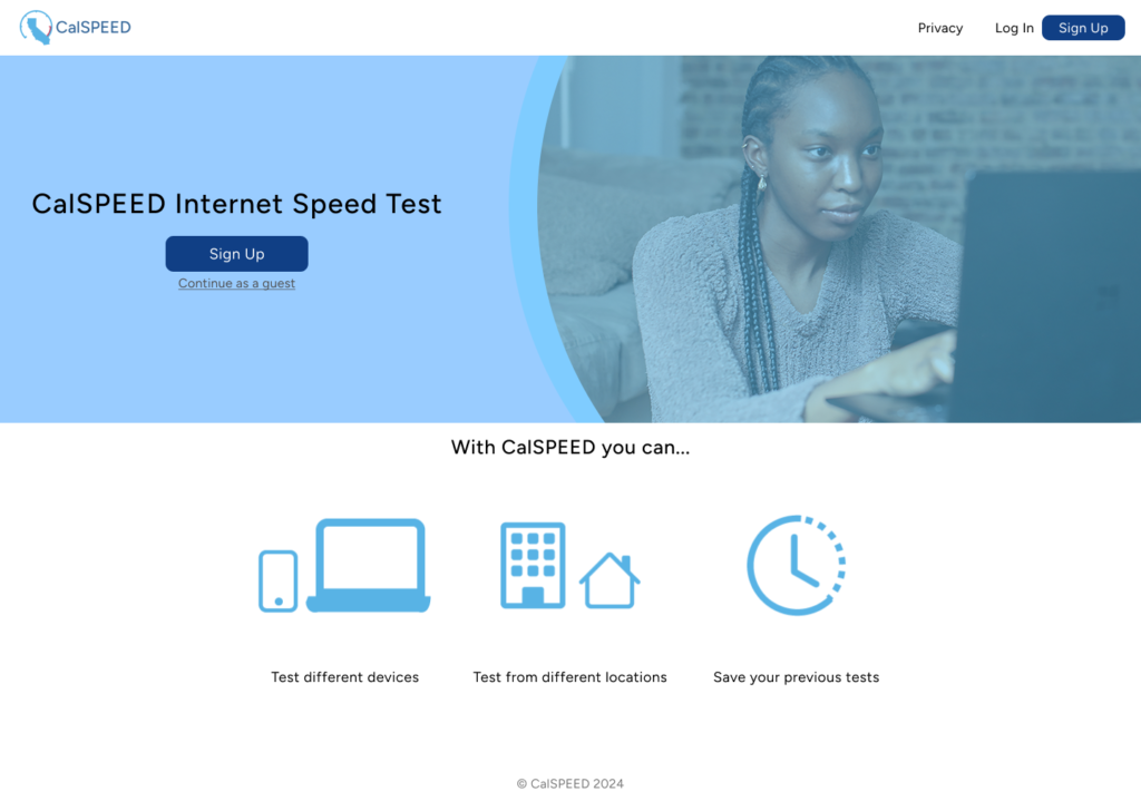
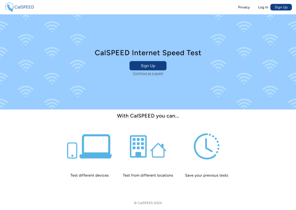
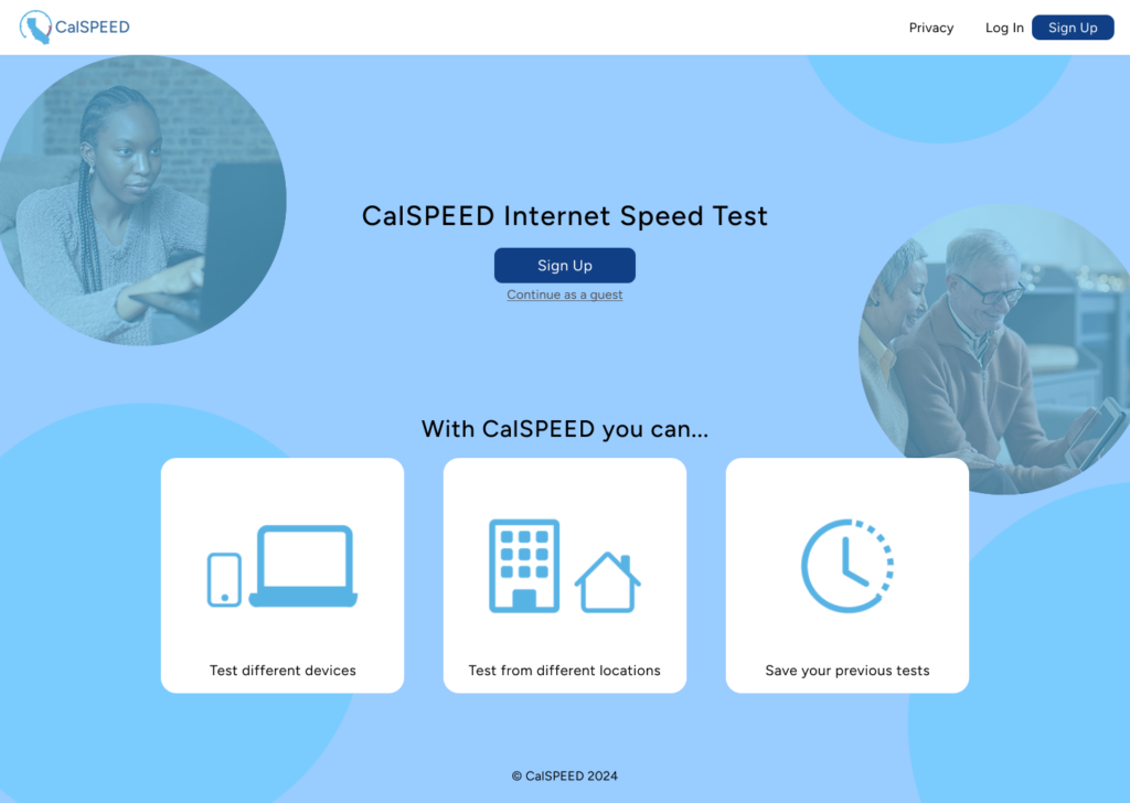
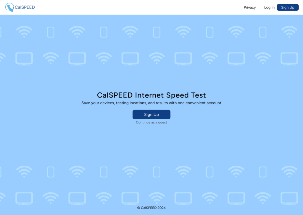
Landing Page Iterations
I was told to focus more on the landing page design, so I made different variations incorporating different visual elements. Colors are also based on existing branding for CalSPEED.
Accessibility Audit
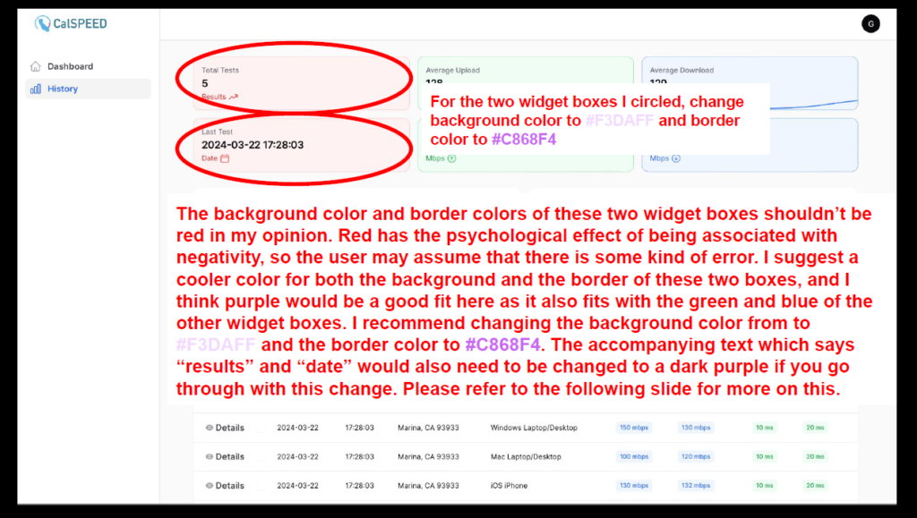
Throughout my time in this role, I made “accessibility audits” of pages the developers had made, which was essentially documentation containing design suggestions.
Landing Page Illustrations
Illustrations I made:



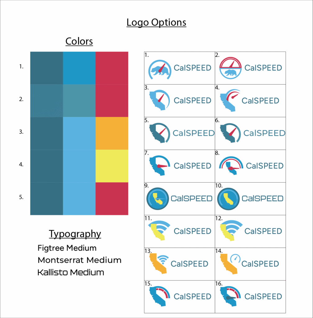
Logo Design
I was also tasked with creating a potential new logo for CalSPEED. Ultimatly, the management decided to go with the CPUC logo for CalSPEED’s website, but this was a good experience regardless.
Reflection
- Learnings:
- Engineers appreciate when design changes are annotated and clearly articulated through slide decks (see example above)
- Sometimes large changes (such as when I suggested switching to a “tab” system for the dashboard) are harder to implement for engineers, meaning small and incremental changes are often more viable
- Challenges/limitations:
- I was the only designer on the development team
- I joined the project when an early, coded prototype had already been developed (made the project less linear without a start to finish pipeline)
- What I would do differently:
- Try to get at least a little bit of user testing done to validate designs
- Create a branding guidelines document or style guide early on in the process (even if a lot of the branding is established)
