Project Details
Term: Fall 2023
Duration: 3 Months
My role: UI/UX designer
Tools: Figma, Adobe Illustrator
This was a project for a fictitious medication management app for the Fall semester course “CST 346: Human-Computer Interaction” at California State University, Monterey Bay.
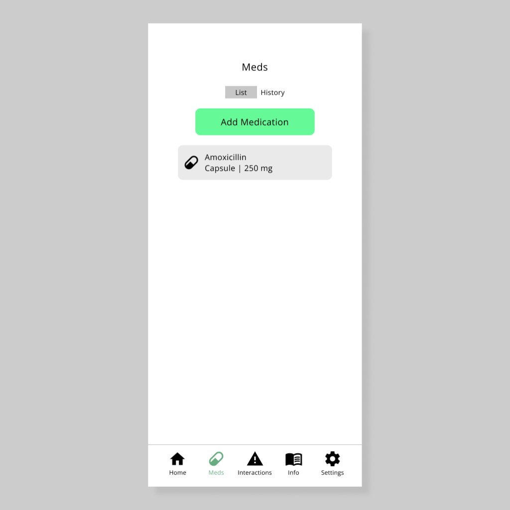
#1: Identifying the Problem
We were first tasked with identifying a problem which we would be tasked to solve for this project. In my case the problem I chose to base my app around was a persistent issue in my everyday life; specifically having to deal with the stress of managing my medications and remembering to take them.
My proposed solution was to create a mobile app which streamlined the process of medication management and made the overall process of managing and scheduling one’s medications as stress-free as possible.
#2: User Interviews
For this stage I interviewed 3 individuals who all have had experience either taking medications themselves or administering them to someone else. Interviews were conducted remotely.
#3: Personas
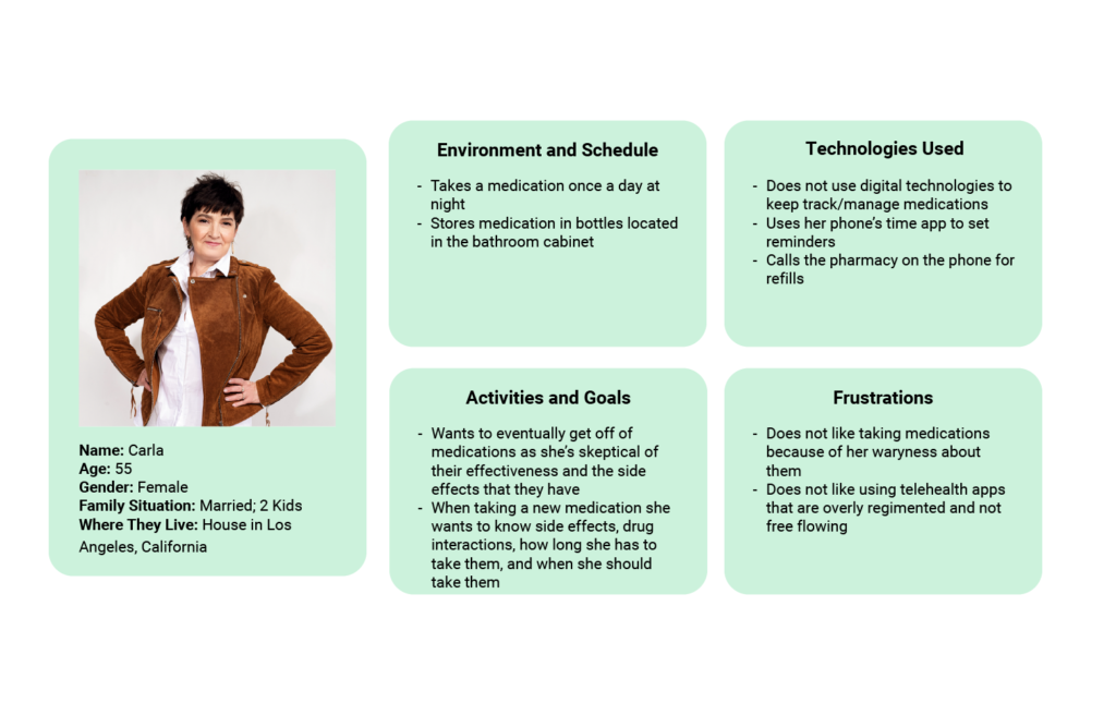
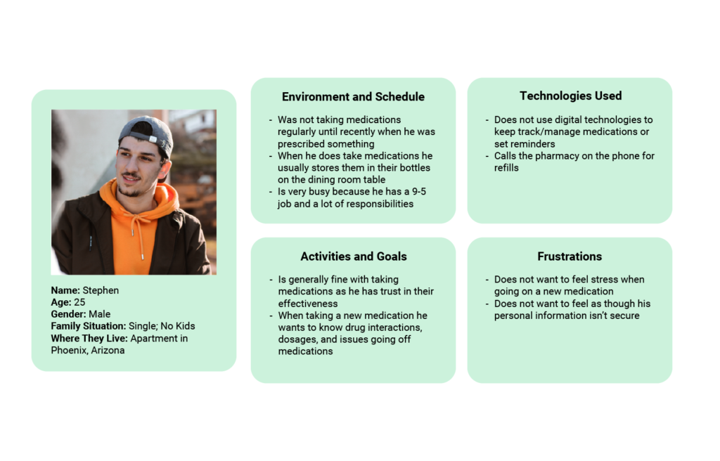
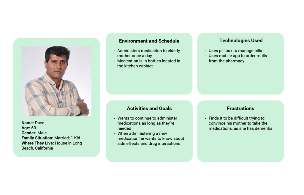
The data collected through the user interviews allowed me to craft 3 user personas to guide the design choices made later.
#4: Task Flow
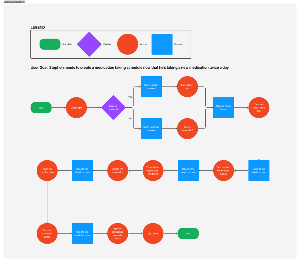
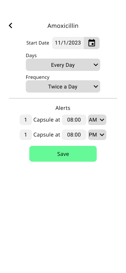
3 Task flows were made based on what the personas would be looking to do in the app. Due to time constraints I could only focus on 1 of the task flows. The main task flow I focused on for this project was creating a new medication schedule on the app for a medication they’re taking twice a day.
#5: Site Map
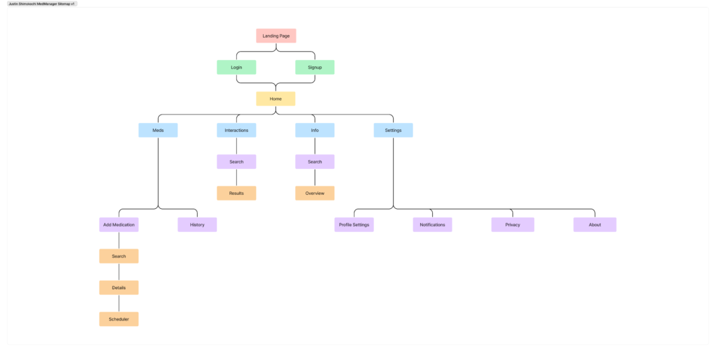
A site map was created based on the necessary screens determined in the flow maps.
#6: Wireframes
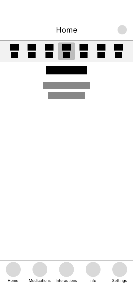
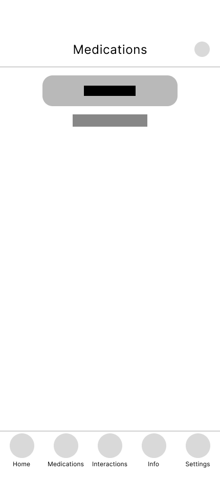
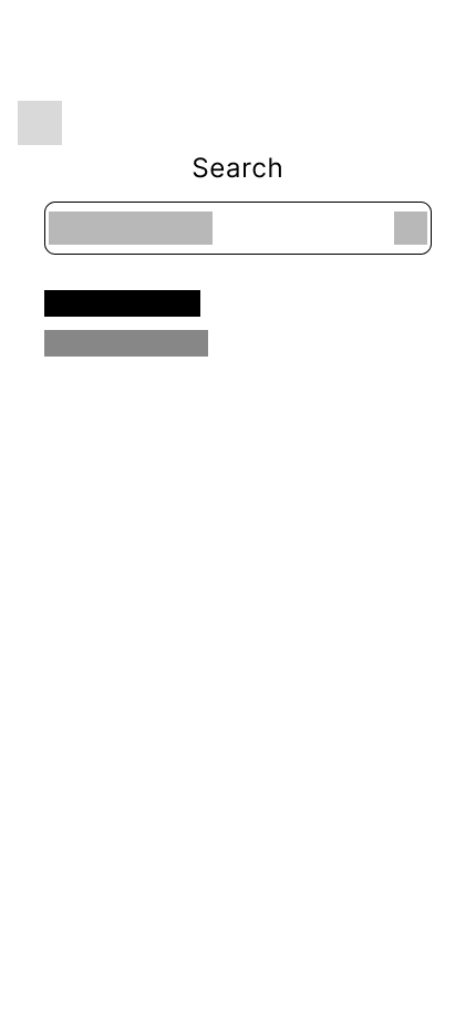
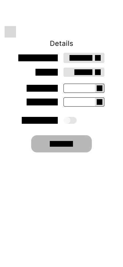
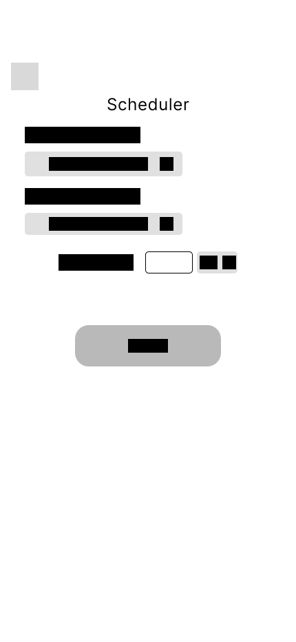
After determining what screens would be necessary to complete the task flow, the layout and general design of the necessary screens was determined by making wireframes.
#7: Prototype
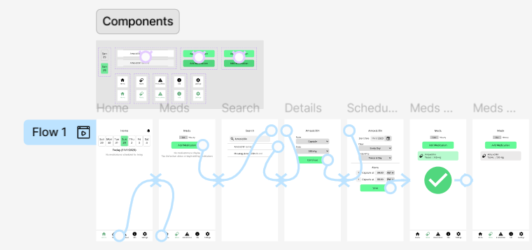
An interactive prototype was made based on the layouts created in the wireframes. User testing was conducted to test usability.
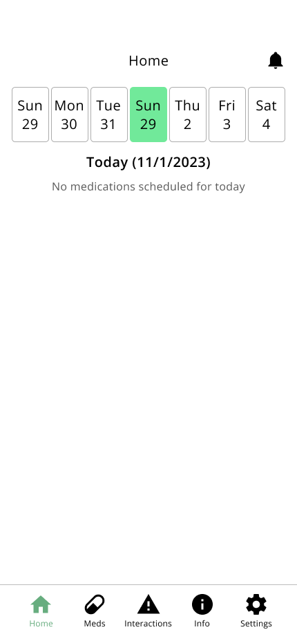
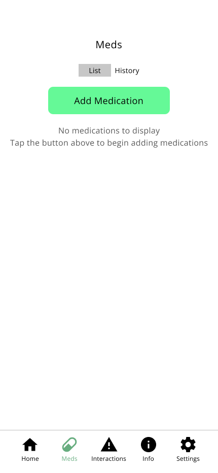
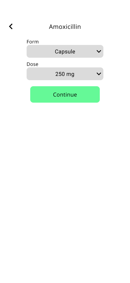
#8: Final Design
After conducting user testing, several changes were made to the visual design and interaction design of the project based on recommendations and observations made by participants, leading to the final design.
What I would do differently
Focus more on visual design
Due to time constraints I was unable to focus more on designing the brand identity for MedManager and instead opted to go with a generic “medical” color palette. If I were to do this project again creating a detailed style guide would be helpful in establishing the brand identity for the app. A logo and app icon was also never designed during the process.
Add screens for other task flows
I didn’t get to create the screens necessary to complete the other 2 task flows I made again due to time constraints. If I were to do this project again I would add screens for the other 2 task flows as well.
