
Duration: 6 months (volunteer), 6 months (contractor)
My role: Web designer
Tools: Adobe Illustrator, Adobe Photoshop, Figma, Squarespace
Client: Vets 4 Vets Santa Cruz
This was initially a service learning (volunteering) project for the California State University, Monterey Bay course: “Race, Gender, and Class in the Digital World.” It involved redesigning the website for a Santa Cruz based nonprofit organization. It eventually became a contract role once the actual website needed to be fully implemented in Squarespace.
Defining the Problem
Vets 4 Vets Santa Cruz needed a website redesign because the old website was not accessibility-optimized and lacked visual cohesion. Some pages were also not responsive (content did not display properly when window resized).
Usability Testing
I had three users test the old website interface. Two users used the desktop version while one user used the mobile version.
I had the users answer two background questions and four tasks/scenarios to complete.
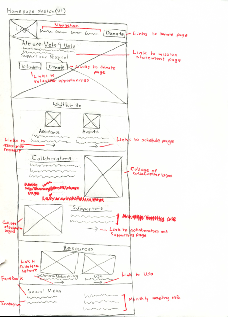
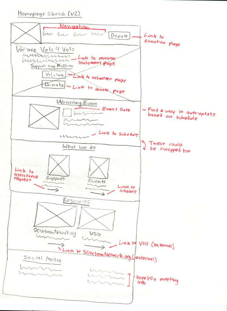
Insight One: Donation Flow
- Summary: Users found that the process of donating was not clear or intuitive
- Evidence:
- Finding the donation button was ranked consistently as the most difficult task to complete, with difficulty scores ranging from 3 to 3.5 out of 5, with 5 being very difficult
- All three users commented that they expected to find the donation button somewhere on the homepage
- Two users noted that “Support Our Mission,” was not a clear donation call to action
- Design decisions:
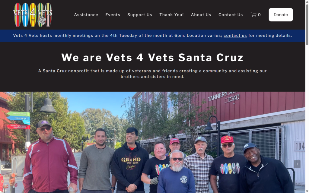
- Have the donation button on the navigation bar will help to increase visibility, right under the “Support Our Mission” copy
- The donation button should also be accessible at all times on the navigation bar, this mirrors modern UI design patterns
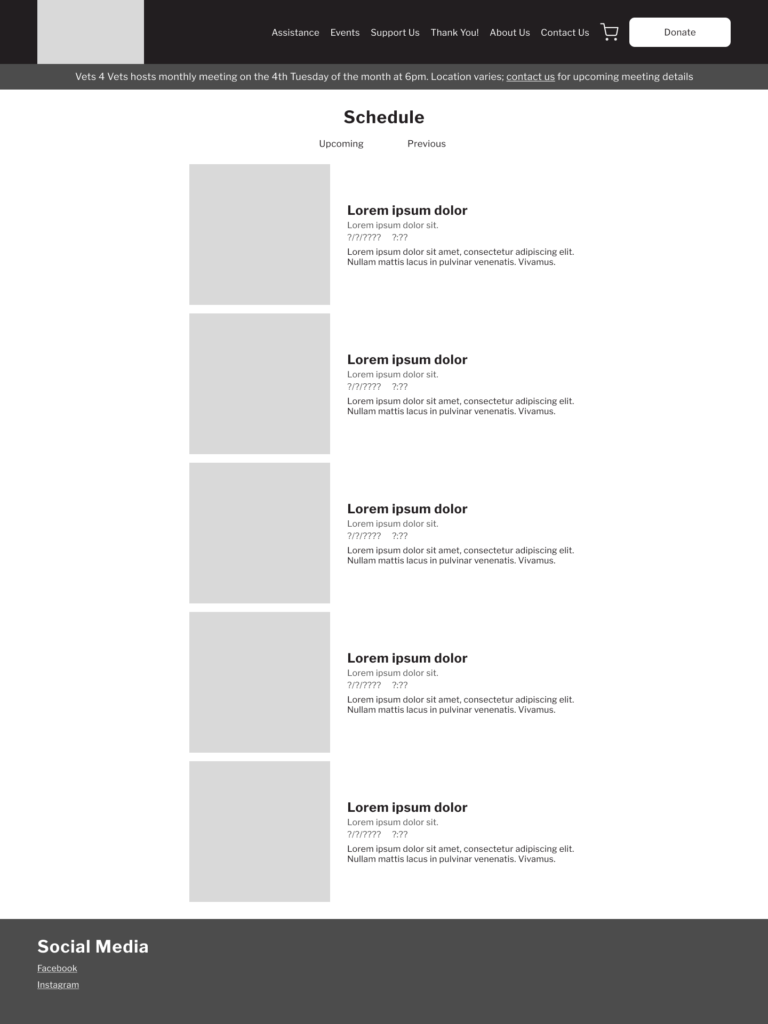
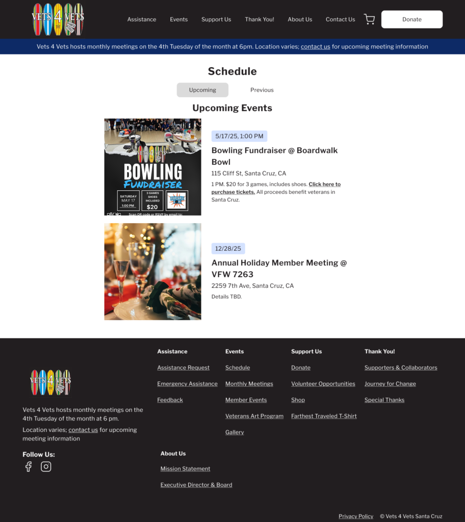
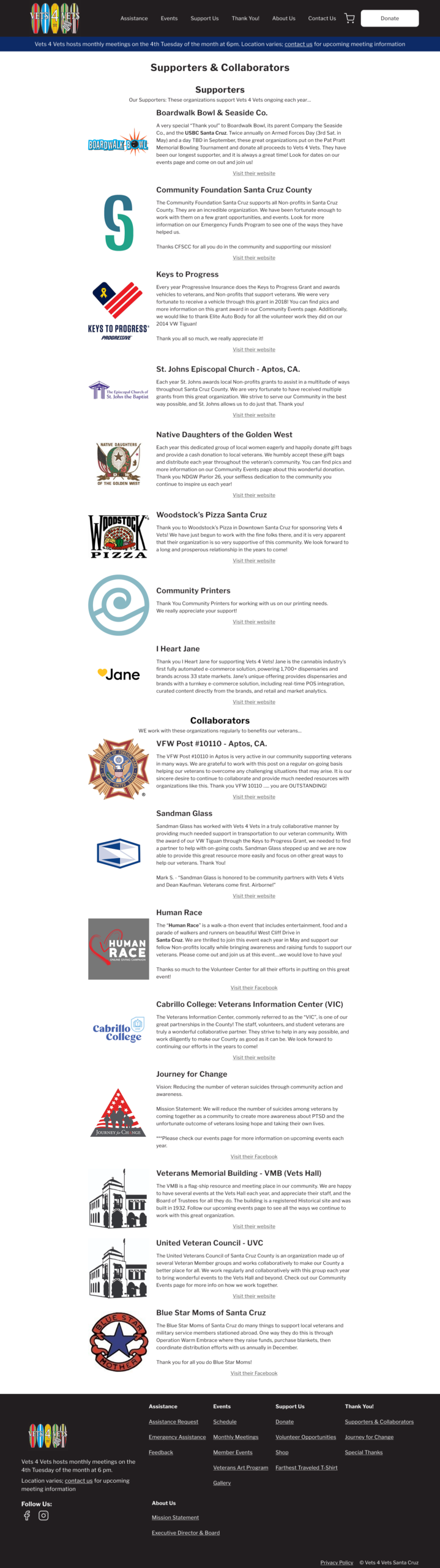
Insight Two: Events Location
- Summary: The process for finding upcoming events had mixed reactions
- Evidence:
- Two users noted on feeling unsure where to click to find the events schedule page
- One user noted the “cluttered” feeling that the events page had
- Design decisions:
- Have an “upcoming event” section on the homepage to show the event that is coming up soon
- Separate “upcoming events” and “previous events” as two separate pages to reduce visual clutter
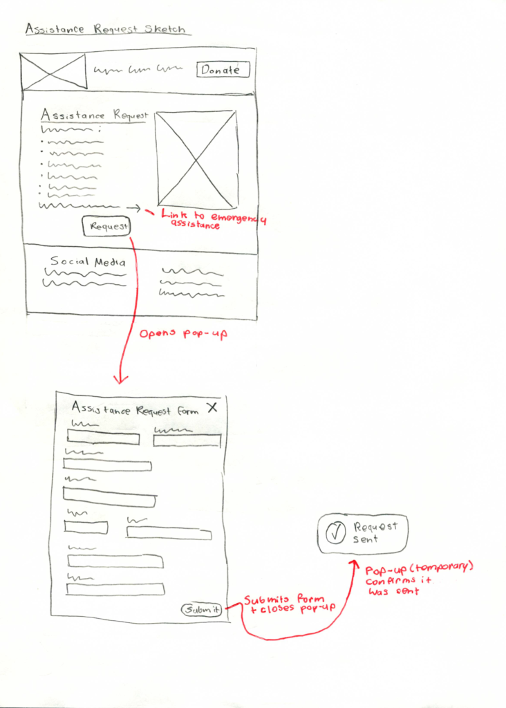
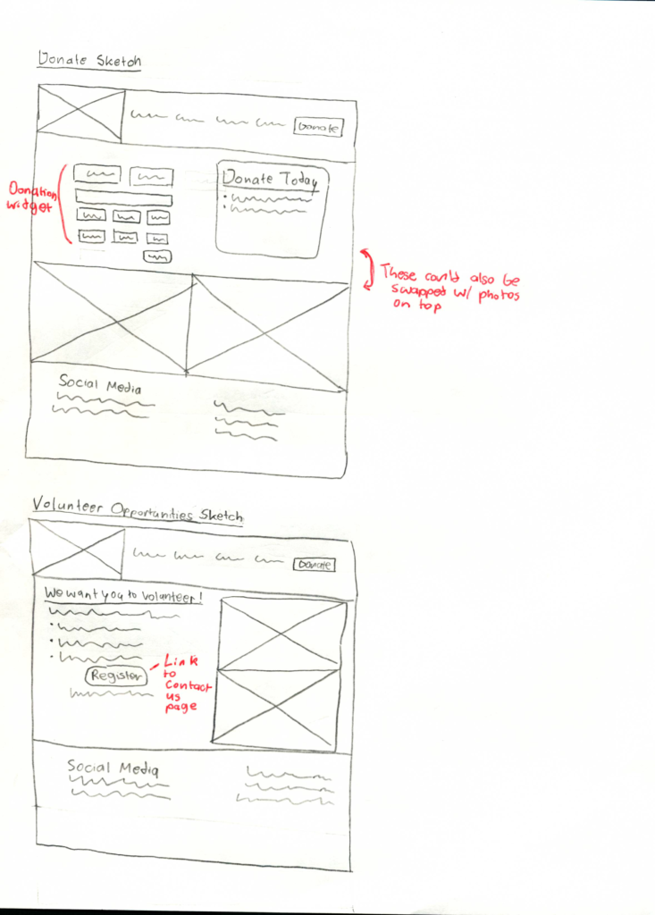
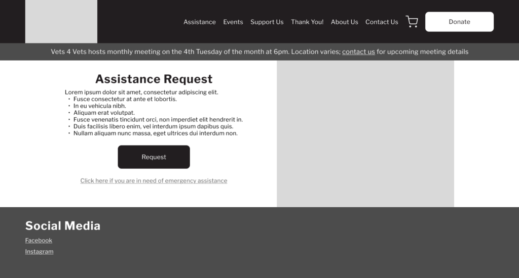
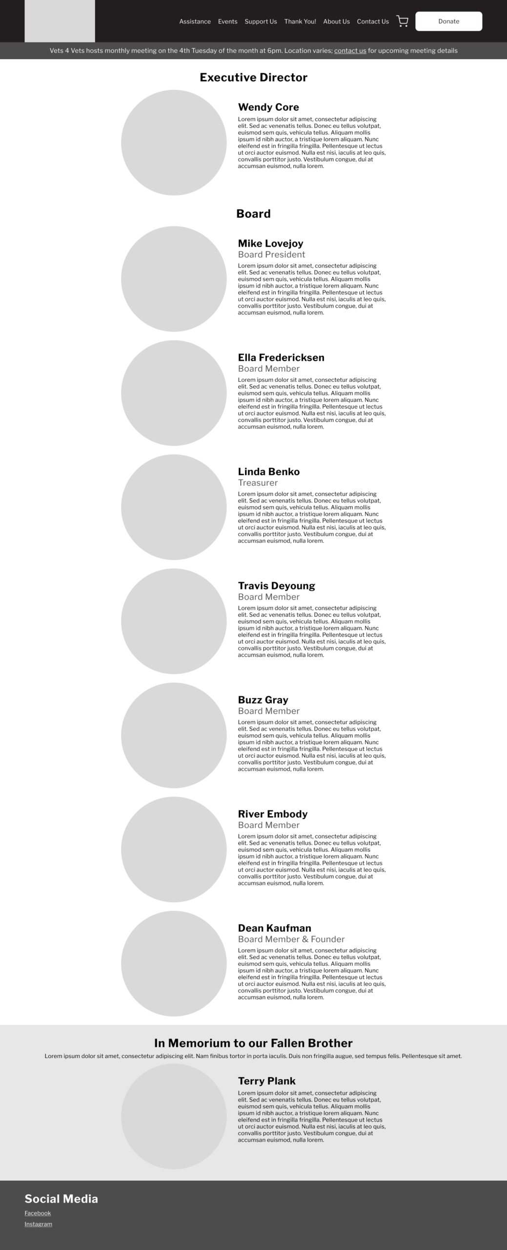
Sketches
I sketched out the main screens for the website.
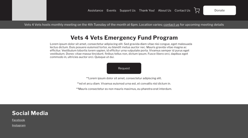
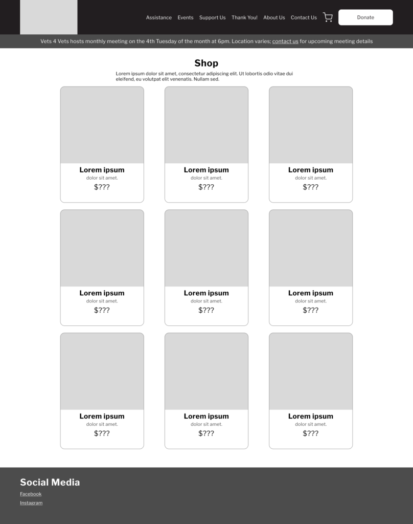
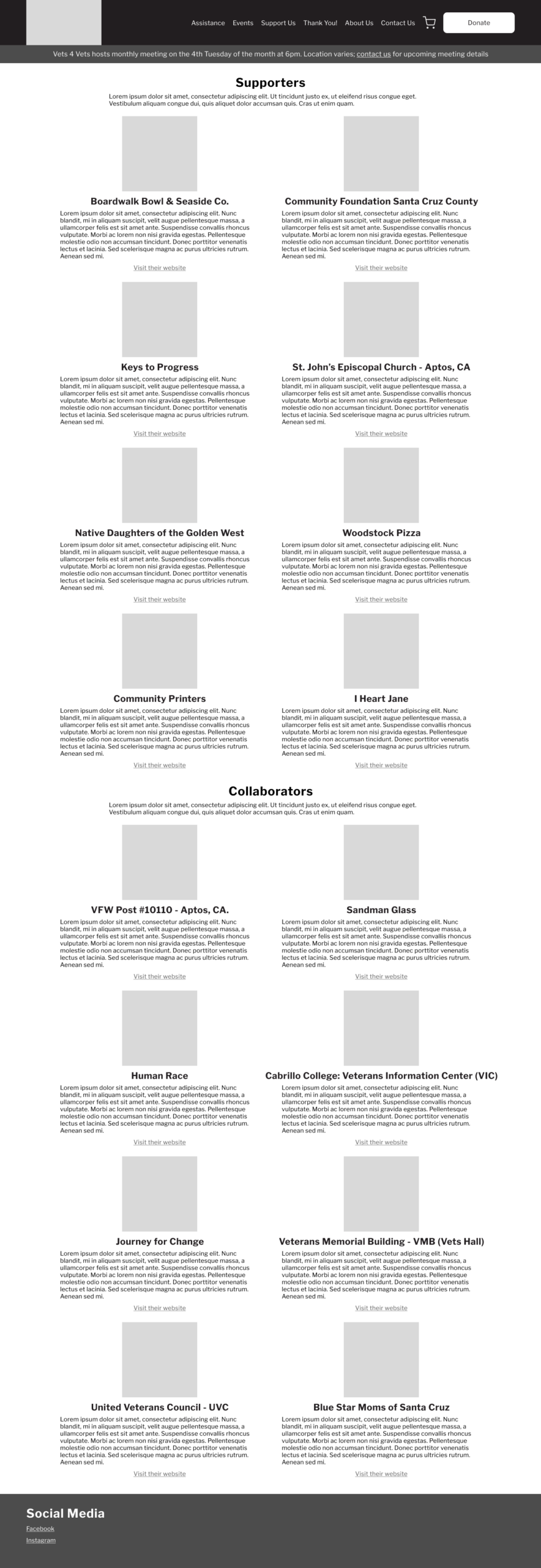
Wireframes
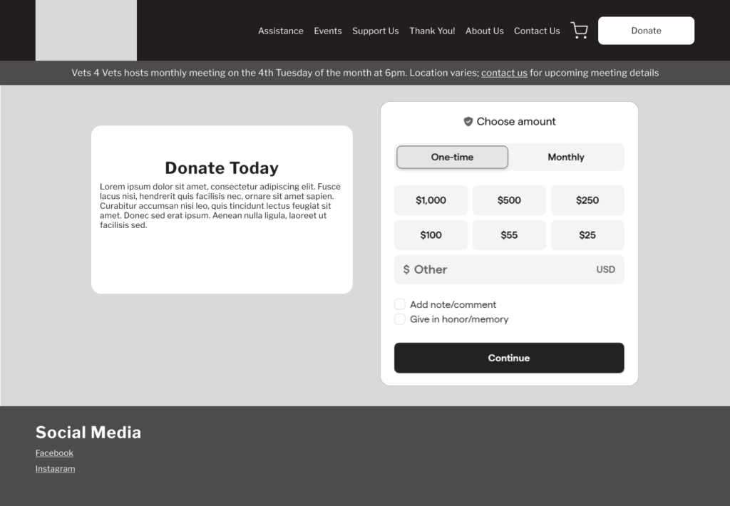
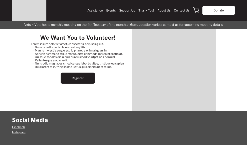
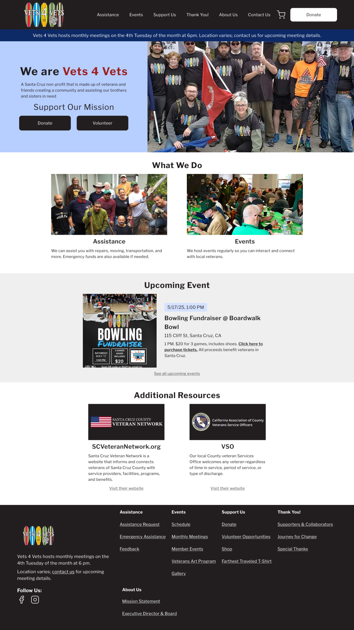
Prototype
Client changed their mind on some of these design choices later, but the general structure/layout remain roughly the same in later versions.
There were Squarespace/Givebutter constraints that I did not forsee when designing these interfaces as well, and the designs had to be modified accordingly once it was moved to Squarespace.
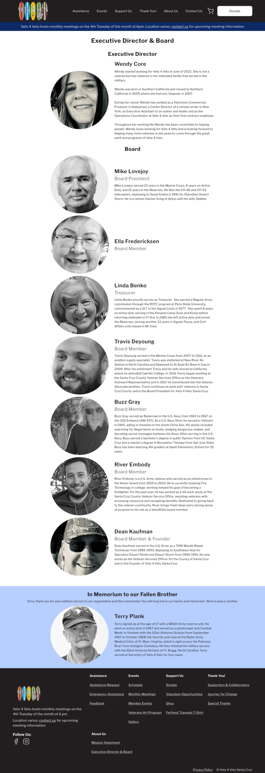
All copy was on the existing website or provided by the client.
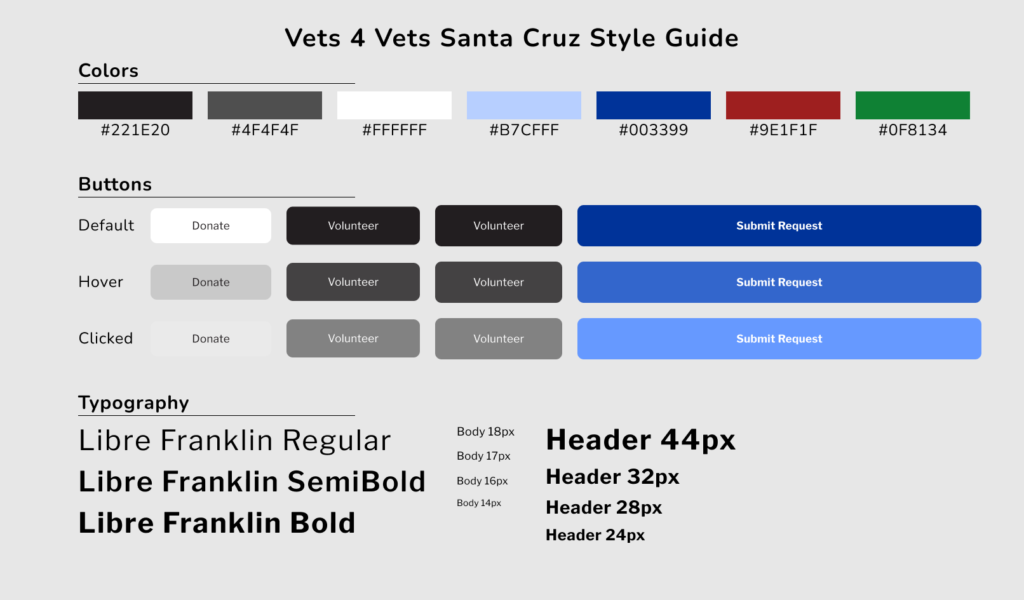
Prototype style guide:
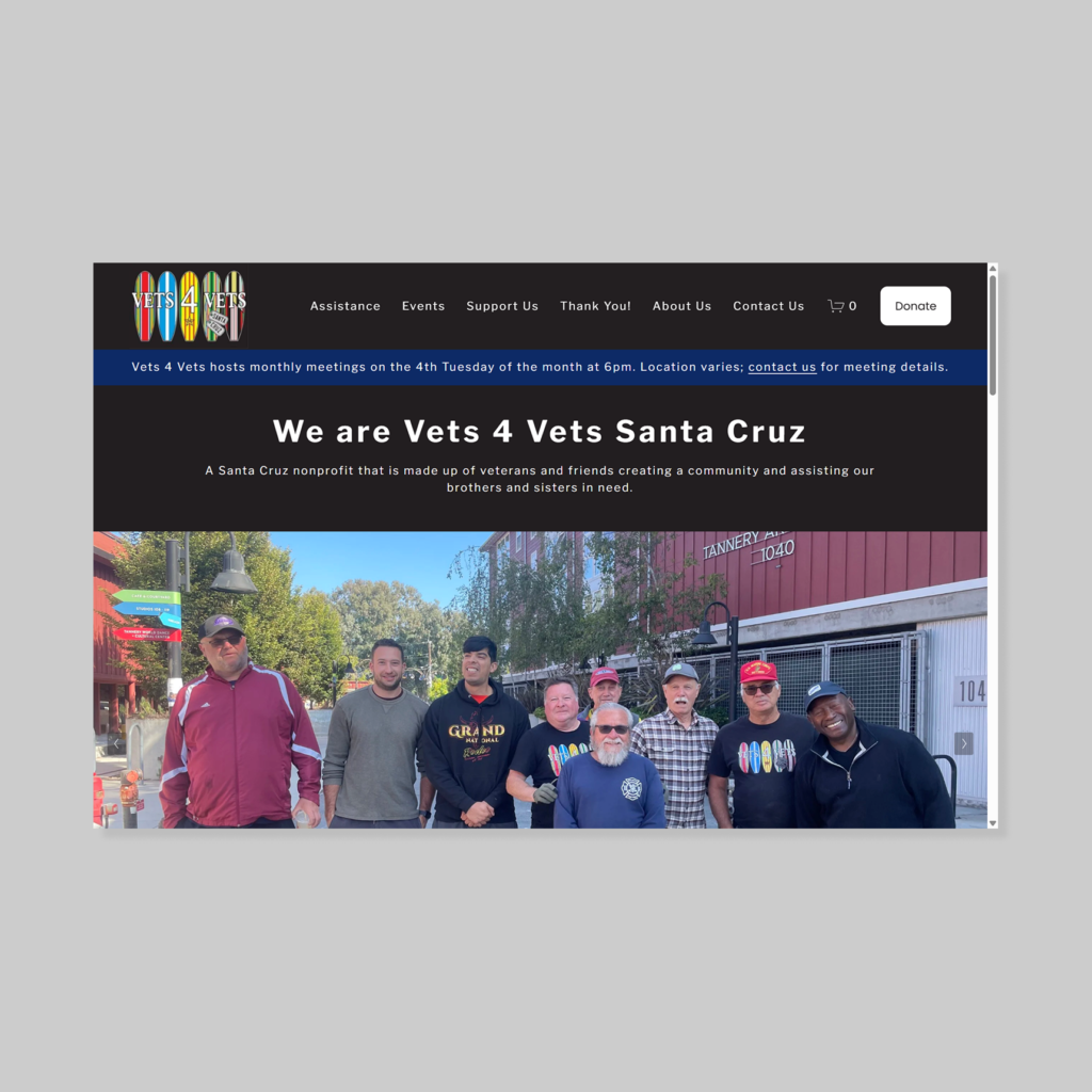
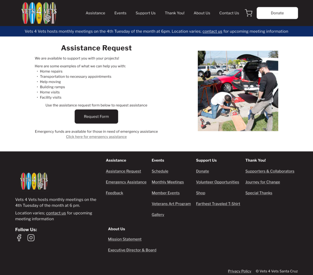
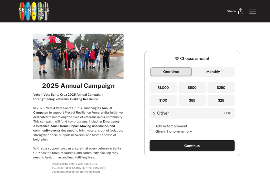
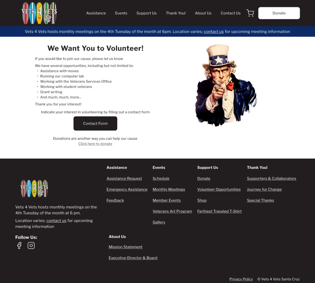
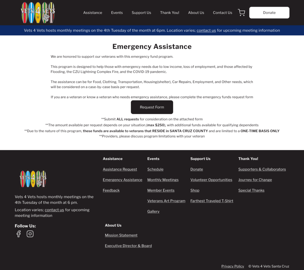
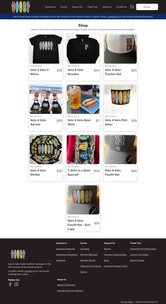
Live Website Design

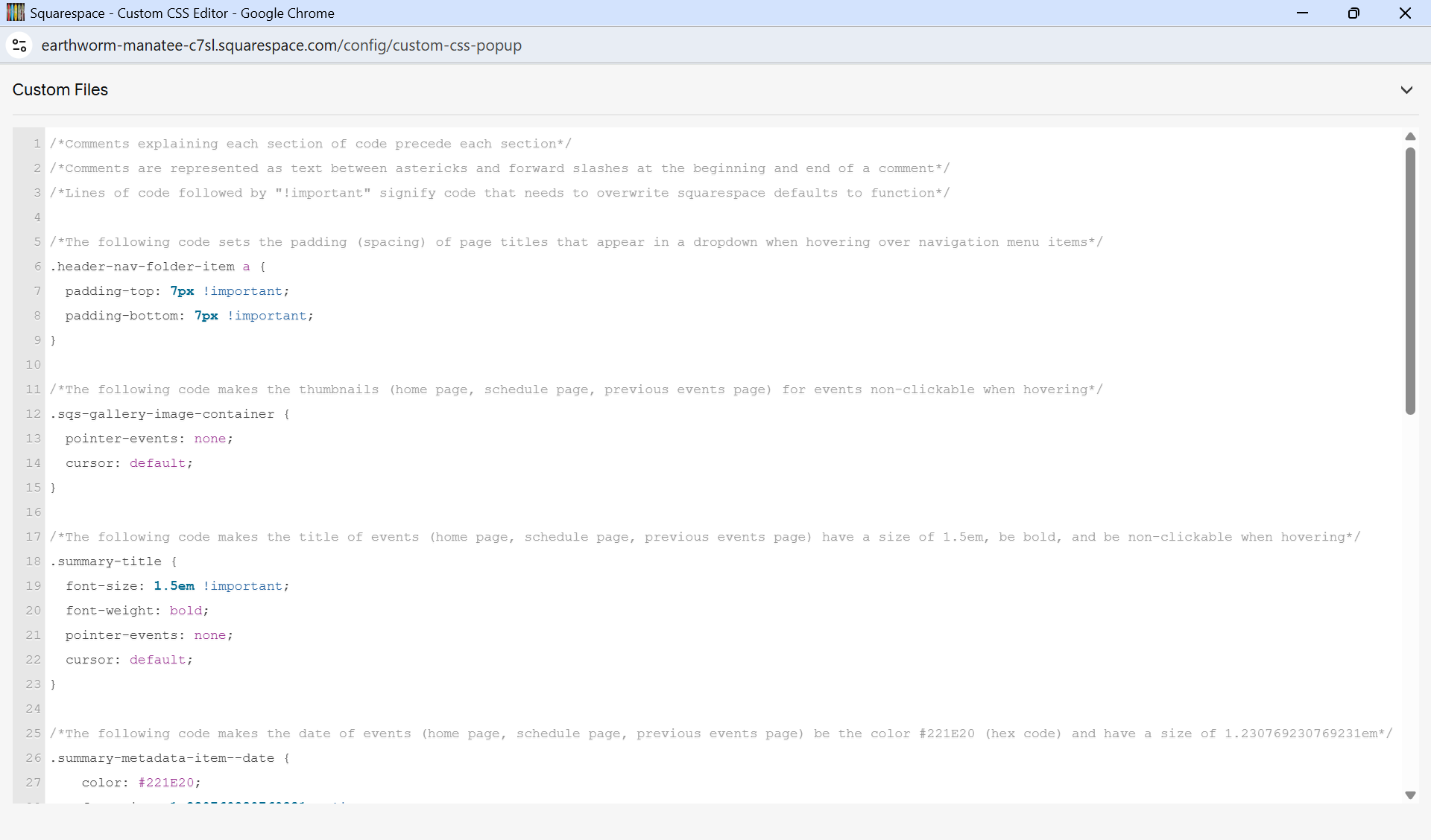
Custom CSS (with annotations):
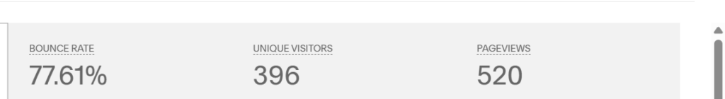
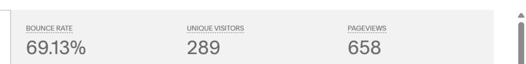
Improved Metrics
My visual design changes and SEO implementation resulted in an 8% reduced bounce rate and a 79% increase in page views.
Metrics before my design (old website):
Metrics after:
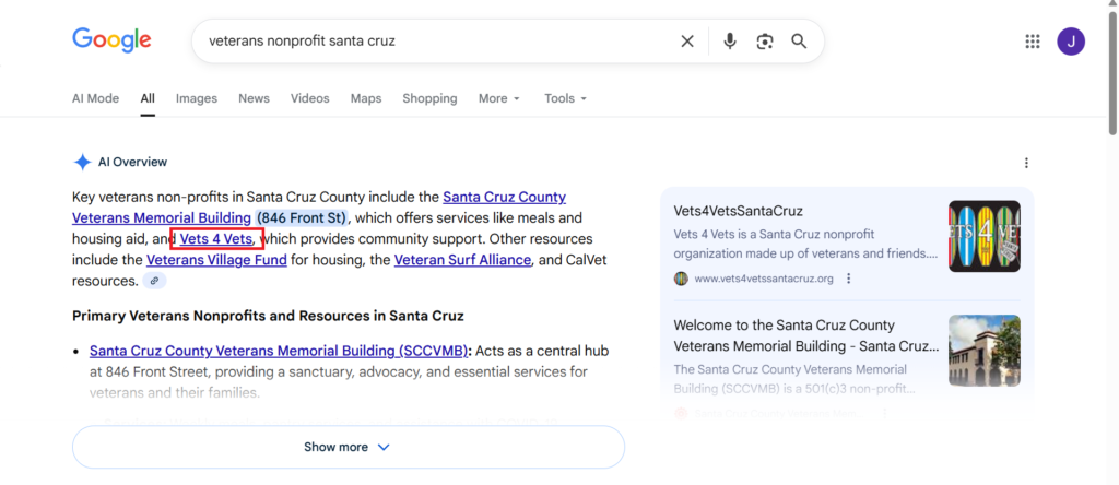
Website in Google AI Overview:
Reflection
- Learnings:
- Before going into the design process (wireframes, prototypes, etc.), it is important to consider what platform/CMS will be used (Squarespace in this case) to implement the design so that any design constraints can be recognized early
- Sometimes it is better to ask a stakeholder questions about project details incrementally rather than asking them a bunch of questions at once, as not all questions need to be answered immediately
- Challenges/Limitations:
- I had only 3 usability testers for the old website
- Squarespace has rigid layout and styling options (even with custom CSS) compared to coding a website from the ground up
- What I would do differently:
- Spend a couple hours familiarizing myself with squarespace before even sketching the initial wireframes
- Conduct a second round of usability testing after implementing my design with new usability testers, see if the flows improved